Clickatell Design System
The primary goal of this project was to establish Clickatell's first-ever comprehensive design system, adhering to the principles of atomic design methodology. This system aimed to streamline the design and development processes, ensuring consistency and efficiency across Clickatell’s product suite.
ROLE: Sr. PRODUCT DESIGNER
TOOLS USED: FIGMA
YEAR: 2020
Overview
At Clickatell, the absence of a unified design language posed significant challenges in maintaining consistency and efficiency across our digital products. As the Senior Product Designer, I spearheaded the initiative to build the company's first comprehensive design system using the atomic design methodology.
My Role
I was responsible for the strategic planning and execution of the design system, ensuring it aligned with our product goals and user needs. This involved collaborating closely with both designers and developers to create a unified and user-centered design language, crafting the visual and structural elements of the system, and actively advocating for its adoption across teams. I also focused on establishing processes for ongoing feedback and iteration, ensuring the design system remained effective and relevant.
Life before the Design System
Before the design system, Clickatell's workflow involved using individual stylesheets and manually copying UI components, leading to design inconsistencies and inefficiencies. The lack of standardization and unified design language made collaboration difficult and processes time-consuming, highlighting the need for a more streamlined and scalable design approach.

THE OLD STYLESHEET
The Process
- Research & Analysis: Conducted a comprehensive audit of existing UI elements and patterns, understanding user needs, design inconsistencies, and technical constraints.
- Defining the Atoms: Identified and created fundamental building blocks like color palettes, typography, icons, and basic UI elements such as buttons and input fields.
- Molecules & Organisms: Merged atoms into more complex, reusable components (molecules) and developed larger interface sections (organisms) for common functions across applications.
- Templates & Pages: Designed templates for common layouts, ensuring molecules and organisms functioned effectively in real application scenarios.
- Documentation & Guidelines: Developed extensive documentation and guidelines for ease of adoption by design and development teams.
The Audit
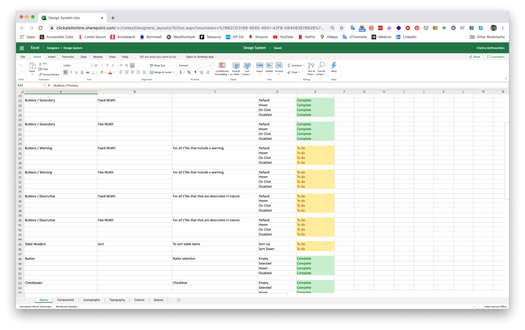
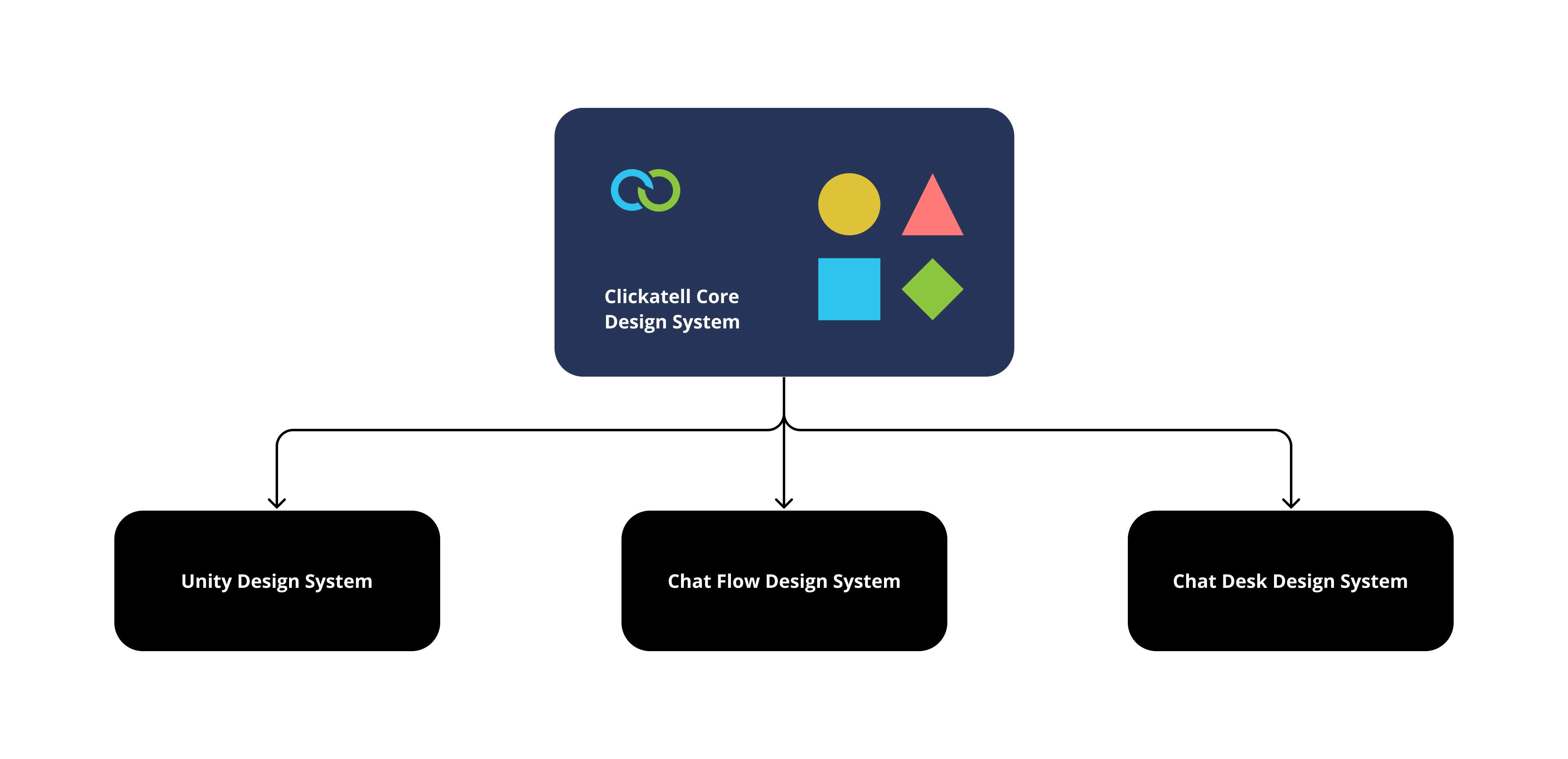
The initial phase required doing an audit and creating an inventory of all established style guides, components, and patterns from Clickatell's product suit: Unity, Chat Desk, Chat Flow, and Campaign Manager. The next task was to assess components that were missing and was required.
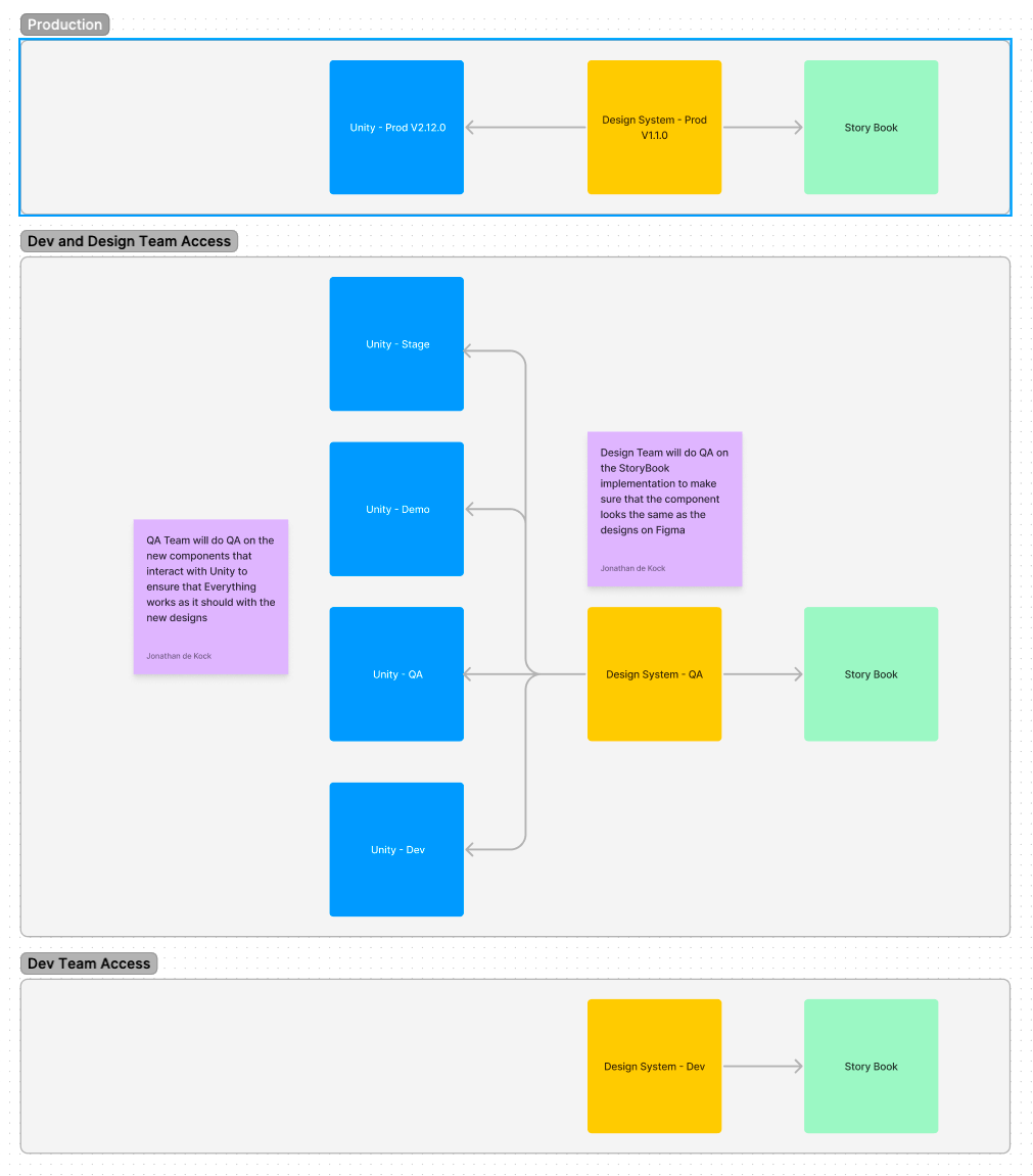
The Technical Rollout Plan
Working with the devs, we developped a rollout plan for the design system to be implemented on Storybook.

Storybook is a frontend workshop for building UI components and pages in isolation. Thousands of teams use it for UI development, testing, and documentation. It’s open source and free.
The goal was to build a cenralized Design System core that would support all the products under the umbrella of Clickatell. The core would provide the foudations like: typograpy, colours, atomic and molecular components, etc.
Building the atoms
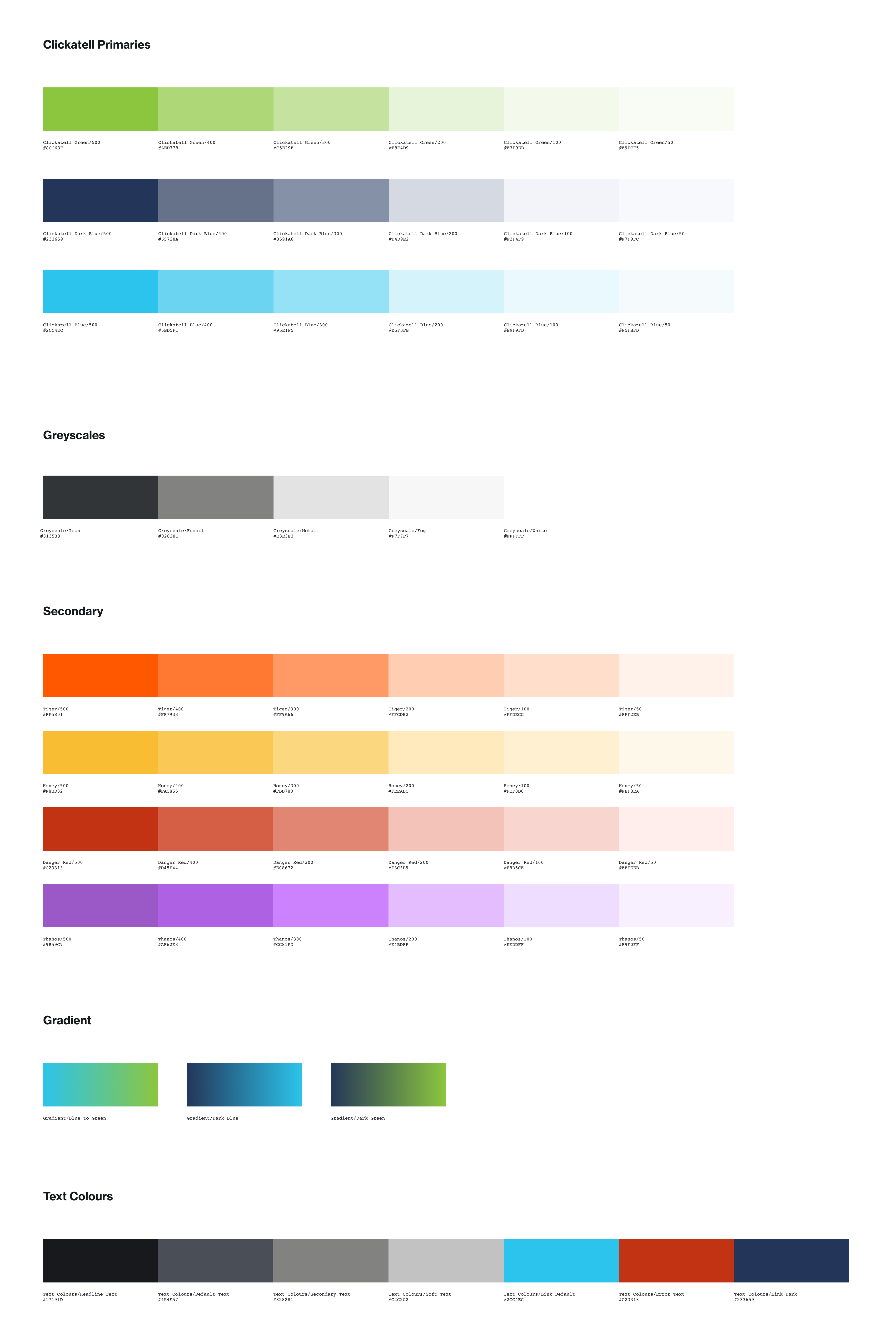
The Colours
The first step was the establish new colours for Clickatell and expand upon the existing brand colours. Colours were themed in saturation, hue, and lightness and assigned proper colour variables (e.g. $clicaktell-blue-500). Each of the brand colours had to have variations in lightness.

Colour variations in lightness
Base Colours

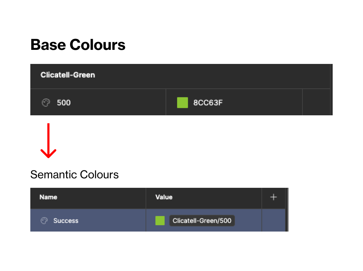
Tokenisation with variables in Figma
BASE & SEMANTIC COLOURS
The base colours were compiled into one collection and then another collection called "Semantic Colours" was created. Semantic colours were more clear defined on their usage in the design system so that designs wouldn't have to second guess what the colour's use was for in their designs.
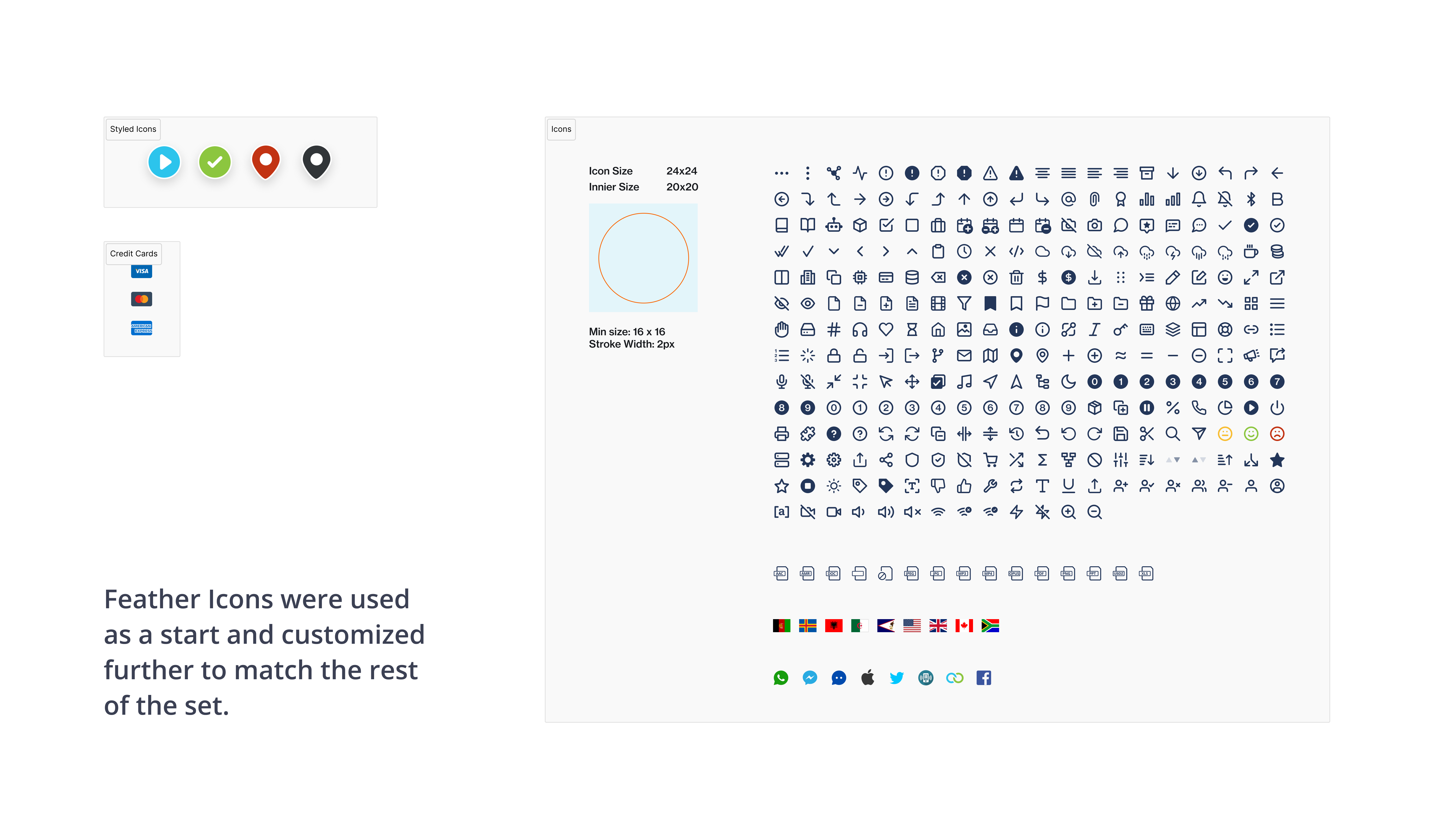
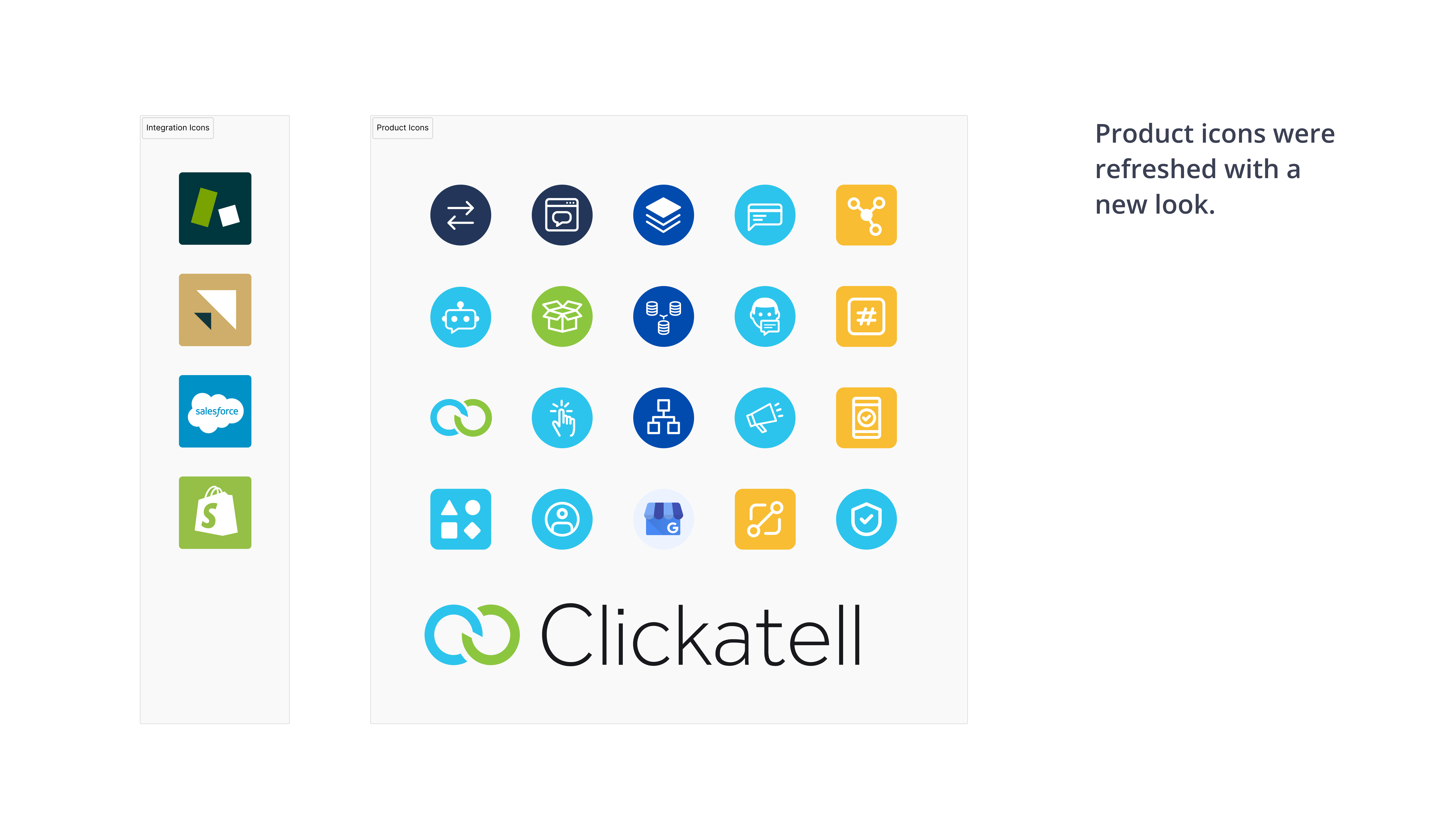
The Iconography
Feather icons were used as a base for most of the icons. They were adjusted and tweaked to match the rest of the set. Icon's were designs on a 24x24px size so that interchanging between them would not cause any component level issues when used.
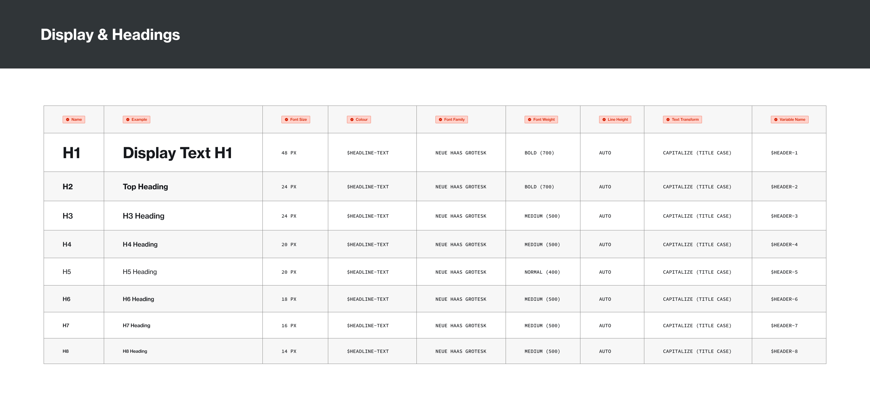
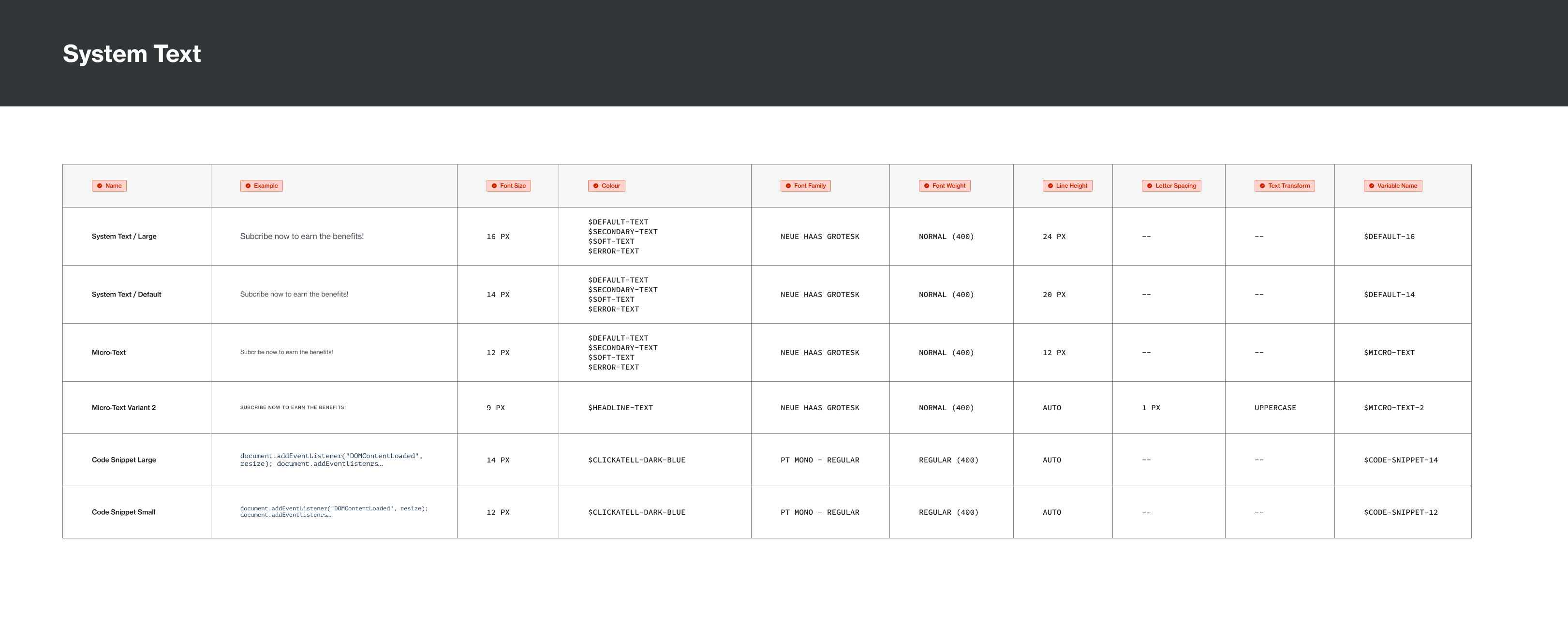
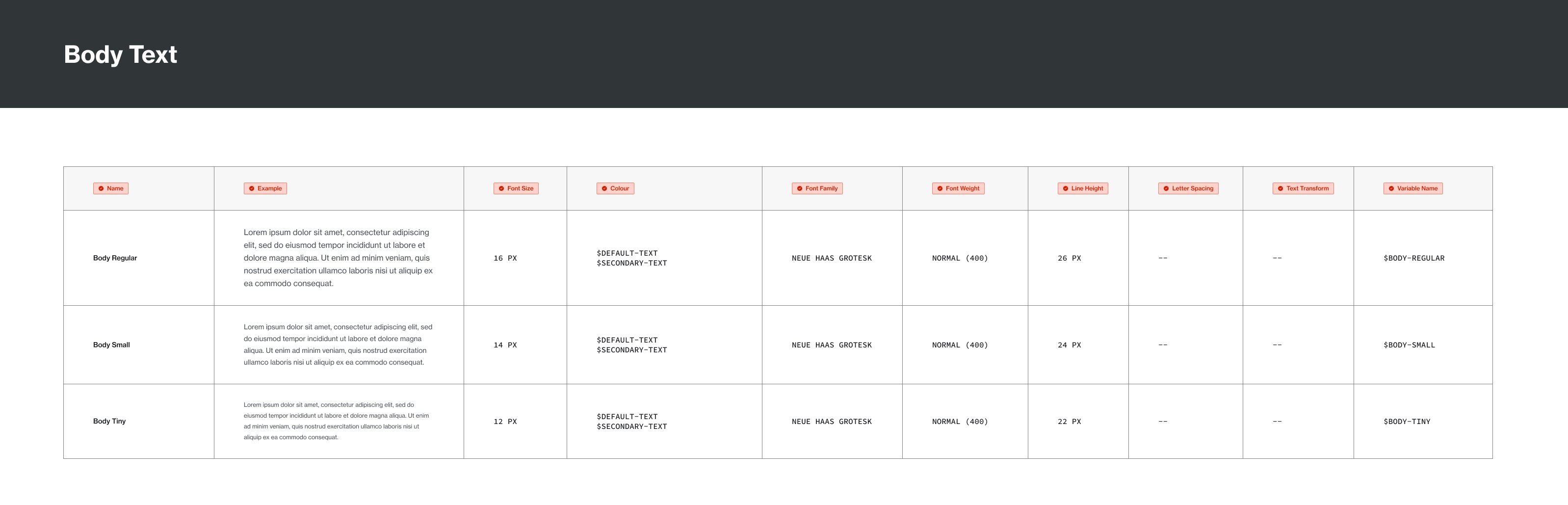
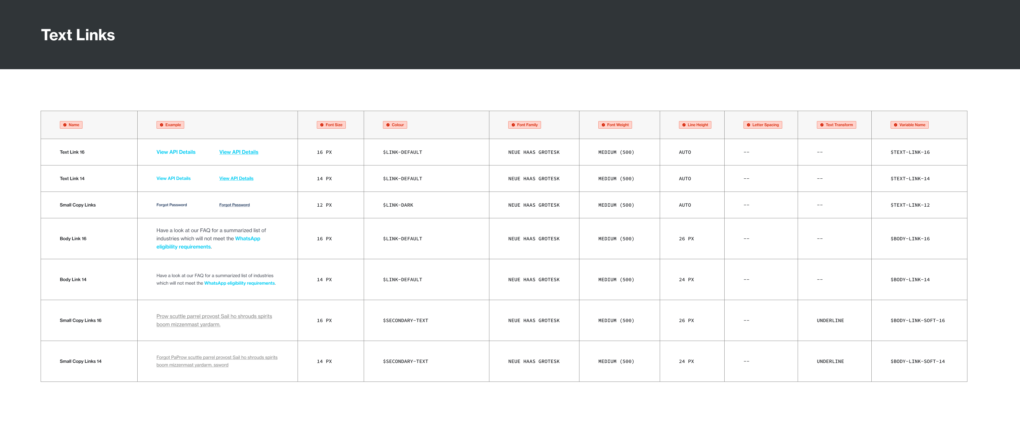
The Typography
Typgraphy was grouped under: Display & Headings – For all headers and display size typography; System Text – For most use in the UI; Body Text – For large paragraphs and posts; and Text Links – For inline texts links and free hanging link texts.
Defining Box Shadows
Box shadows were created for 4 states of elevation. "Elevation is the relative distance between two surfaces along the z-axis" (Google Material Design)

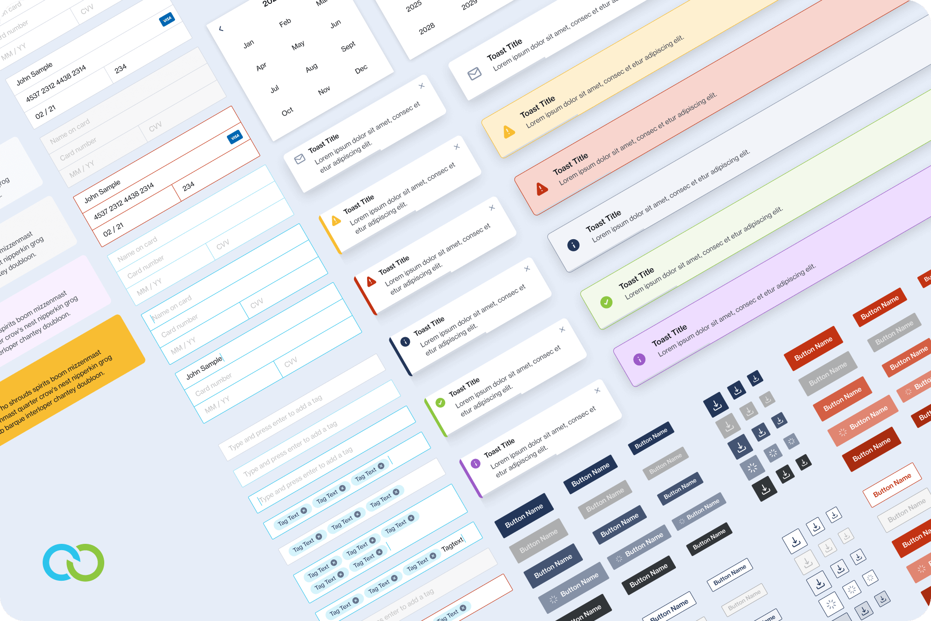
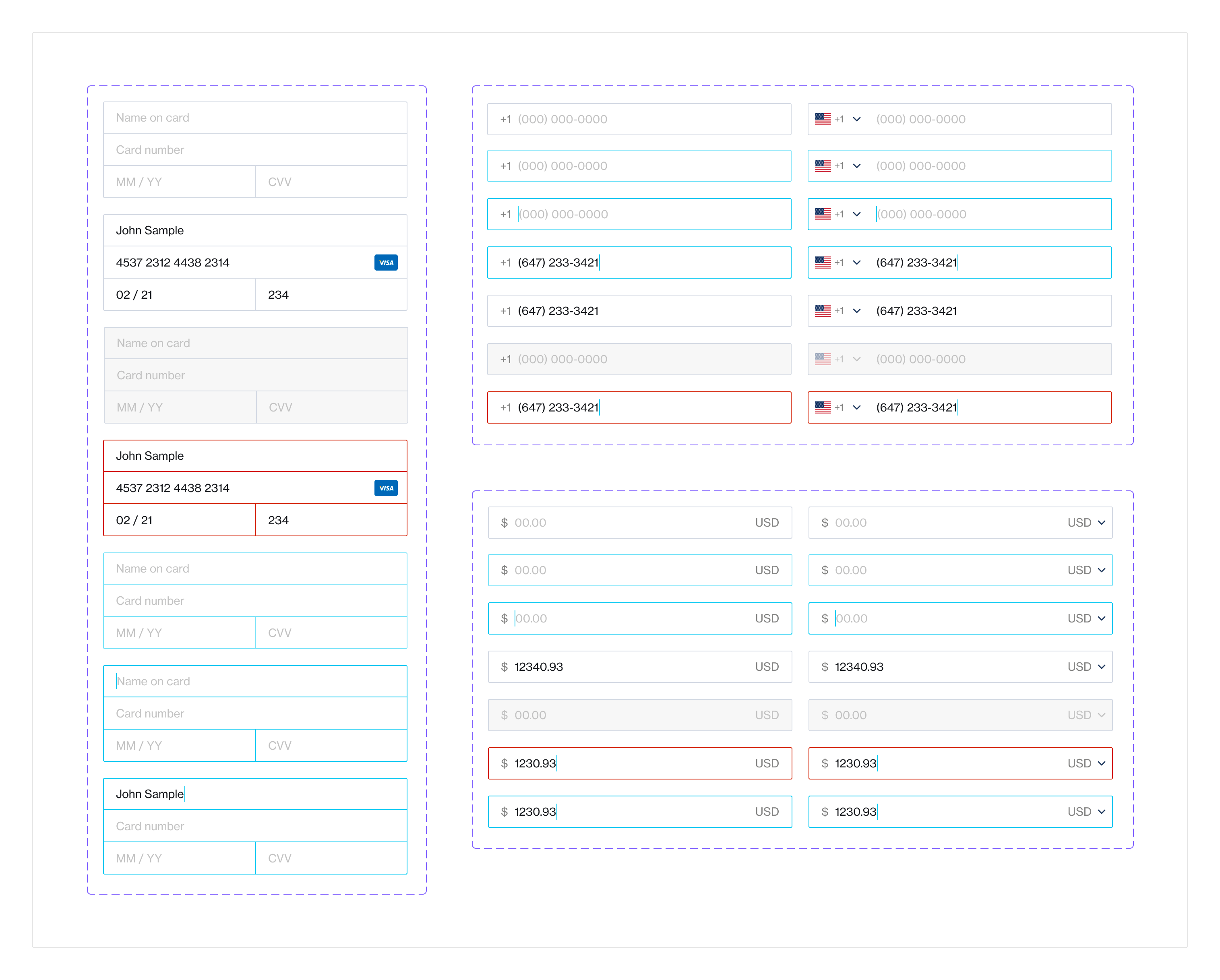
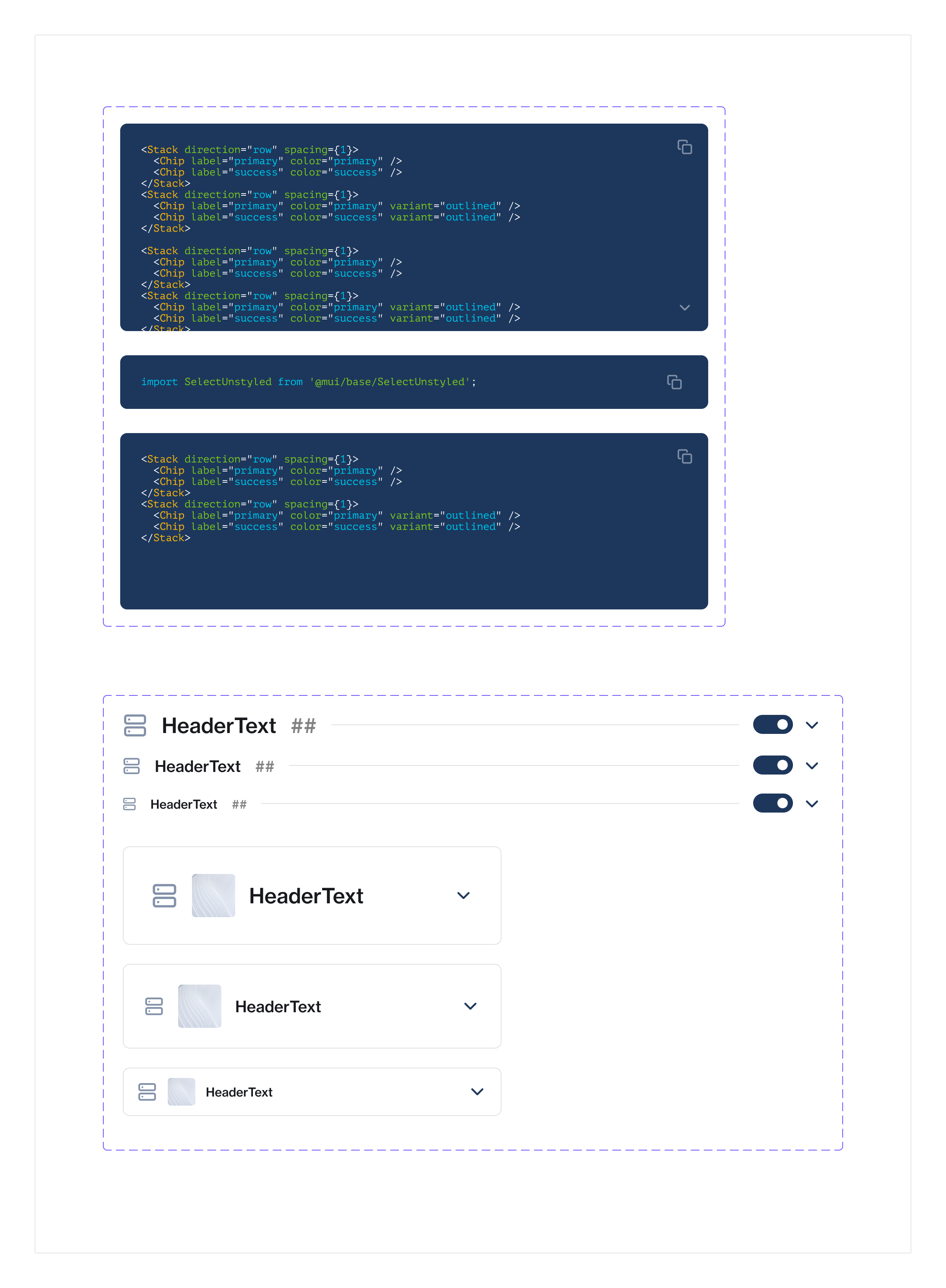
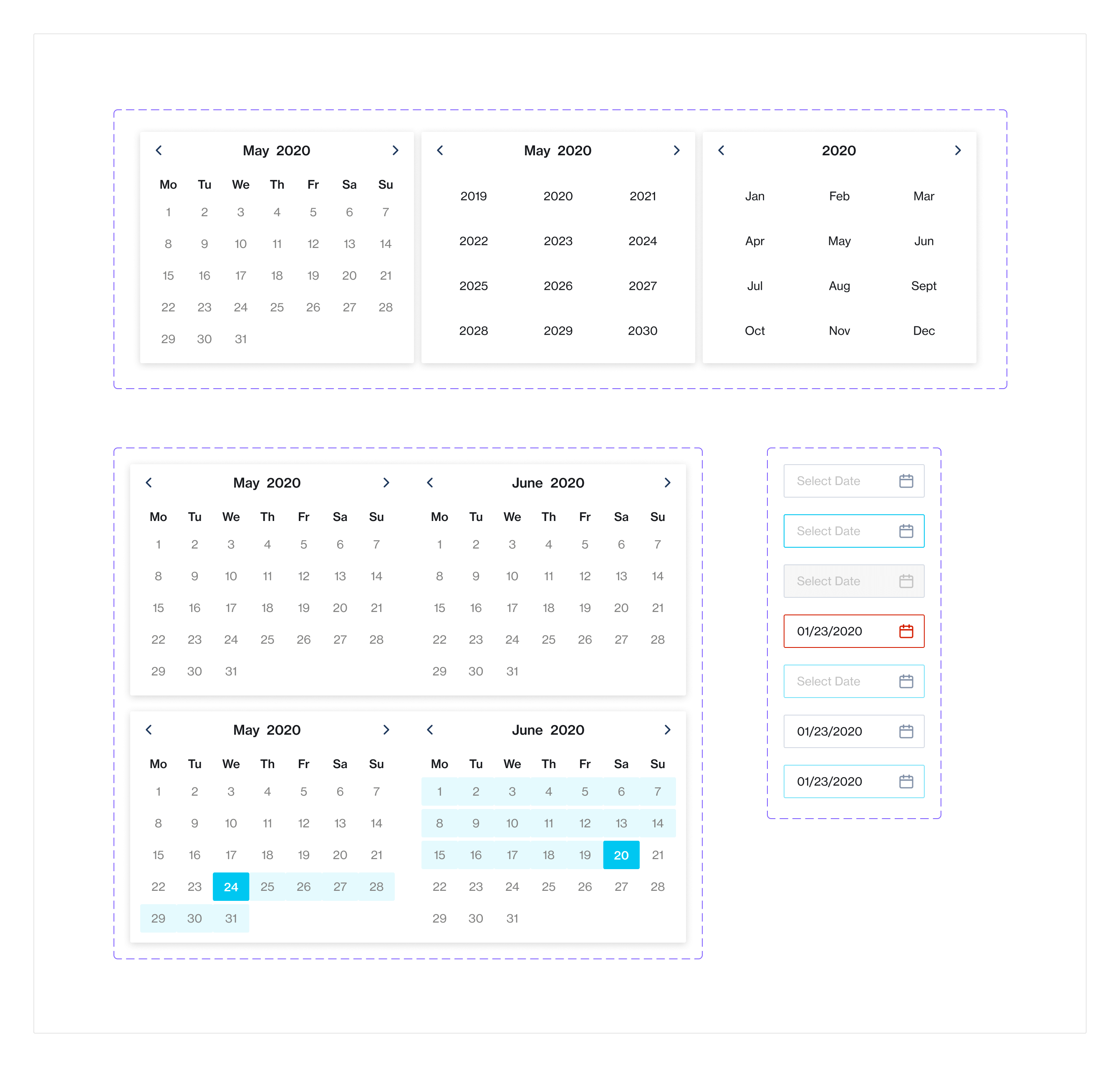
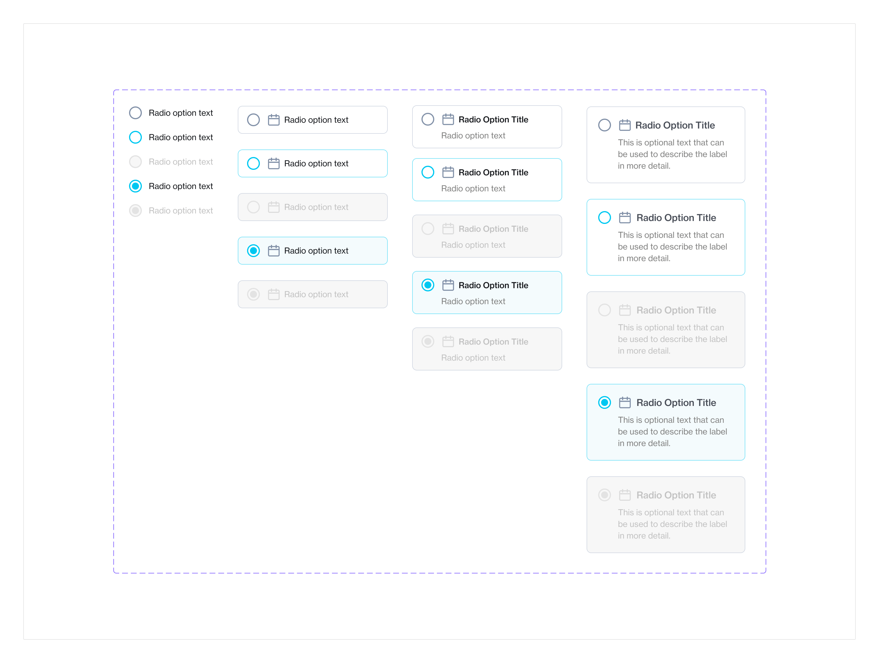
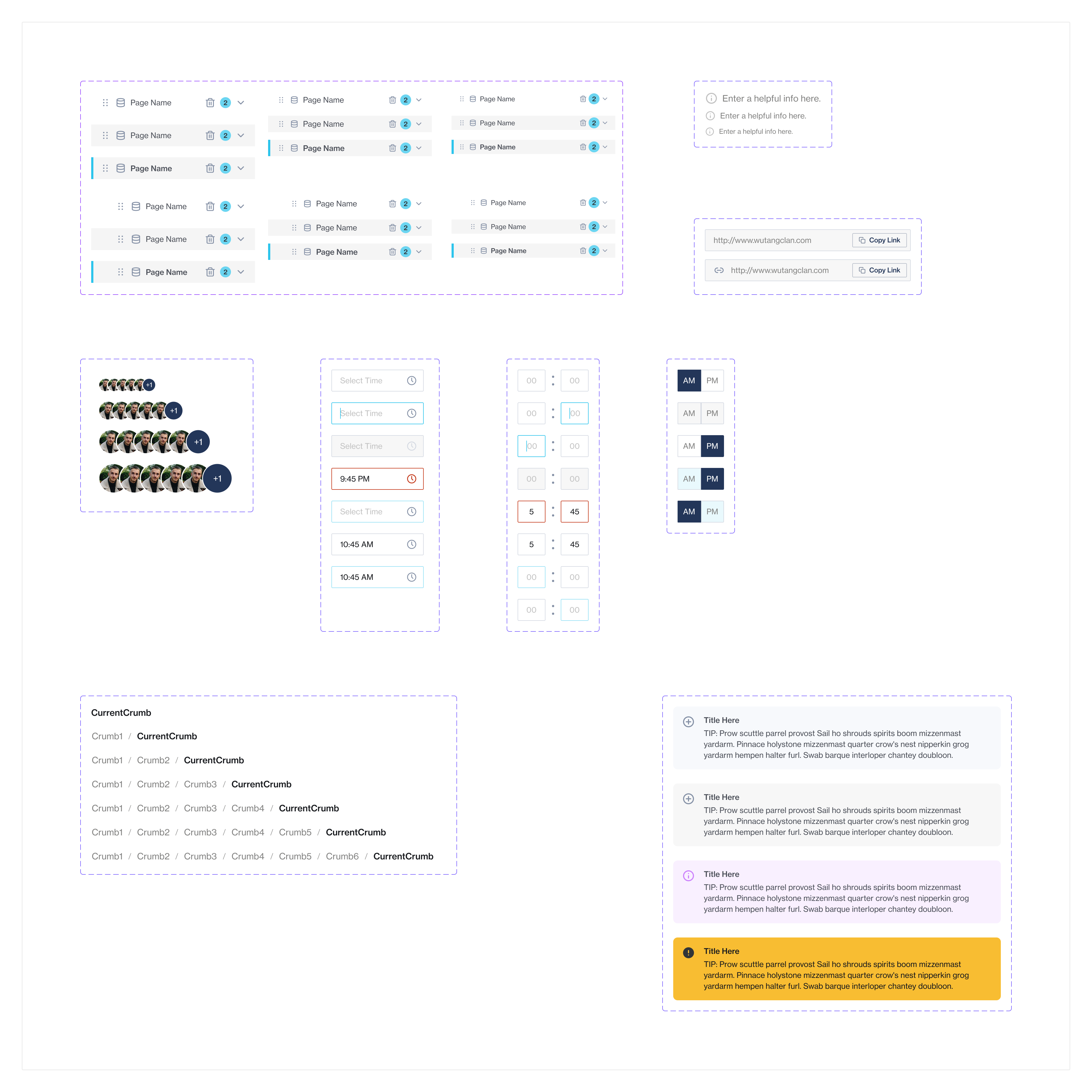
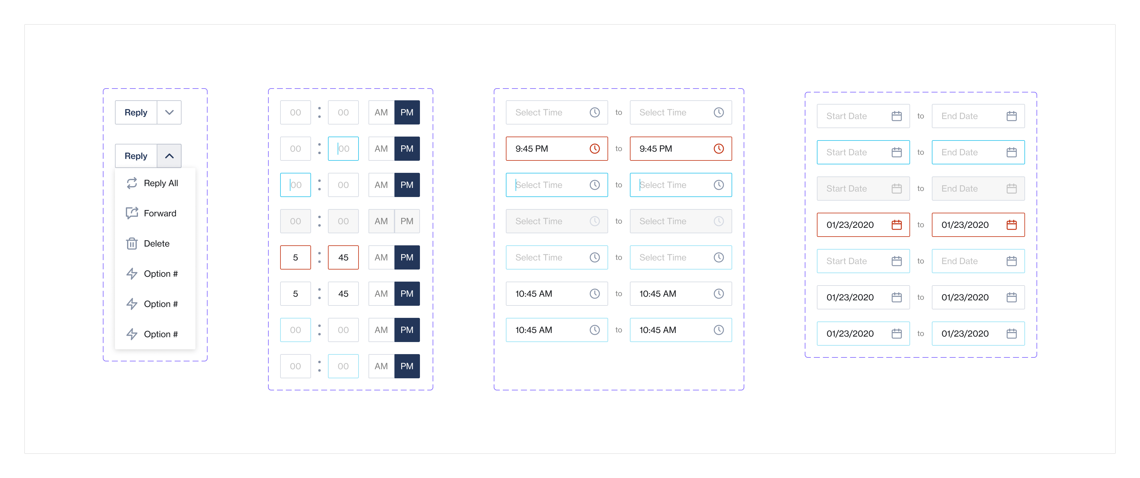
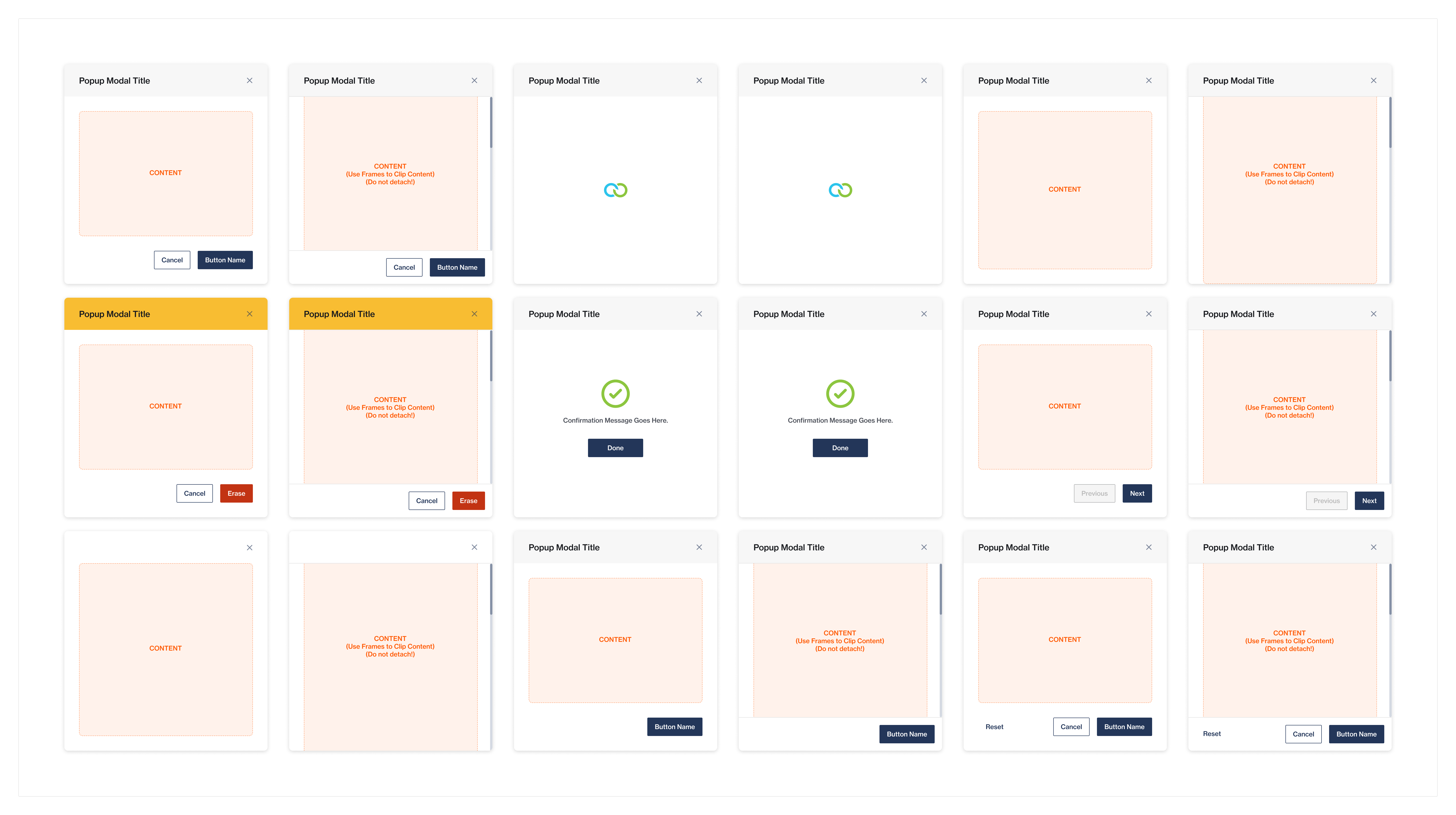
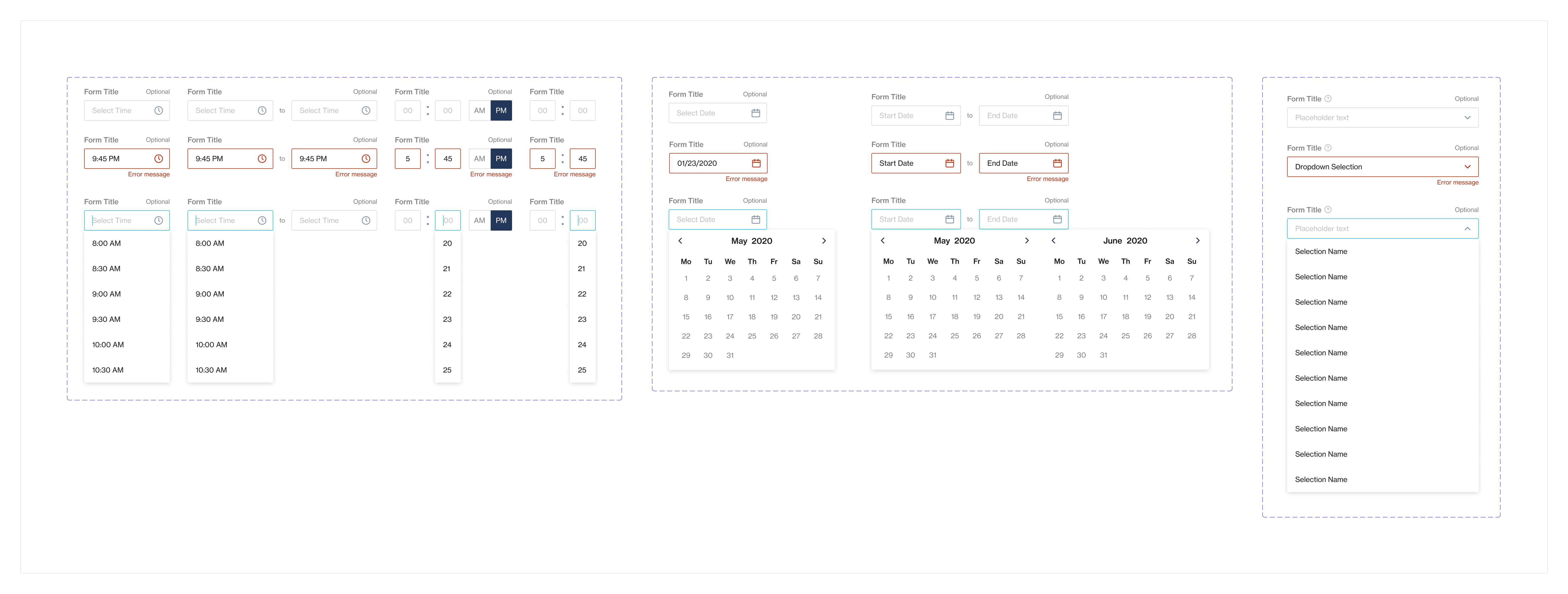
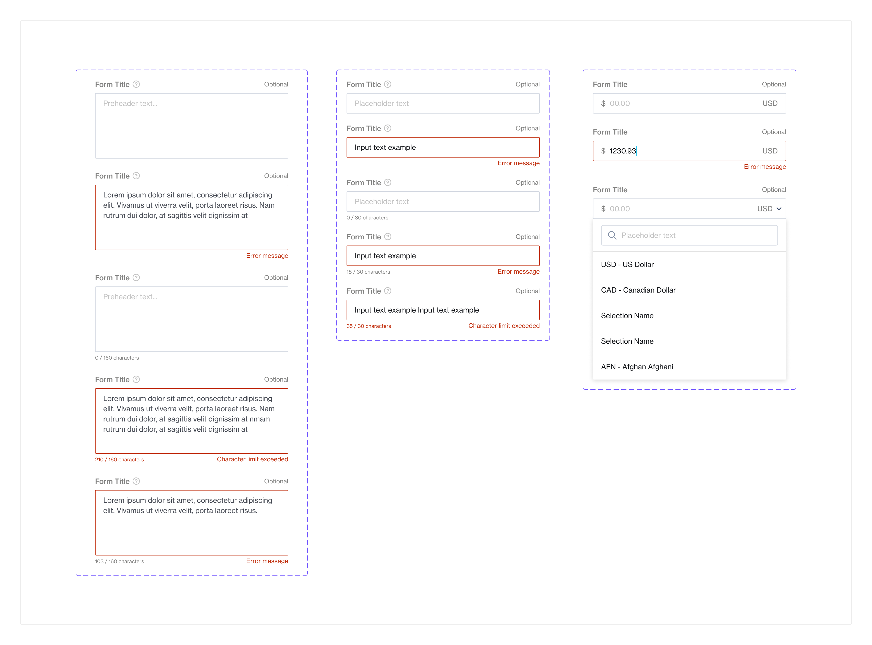
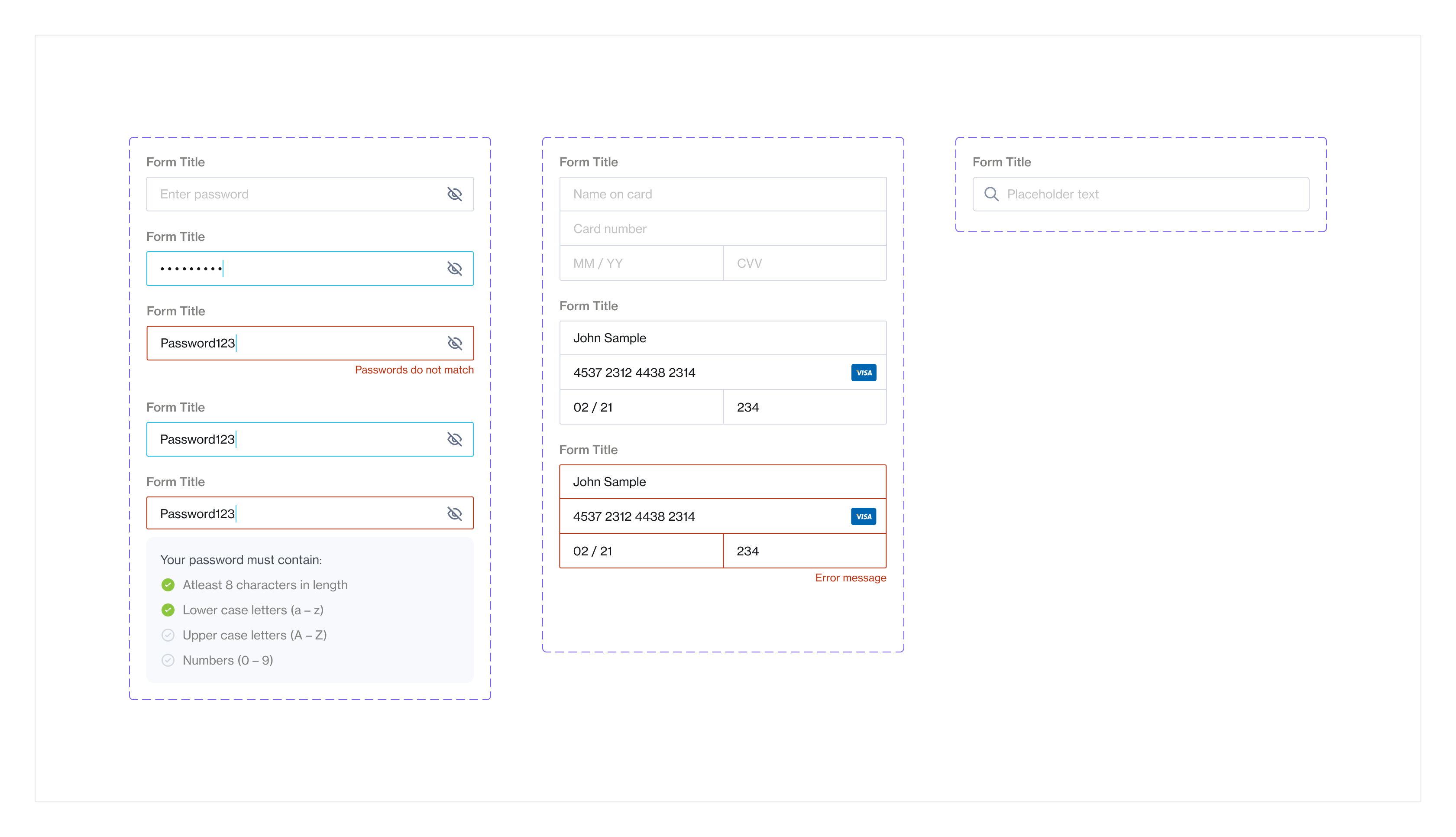
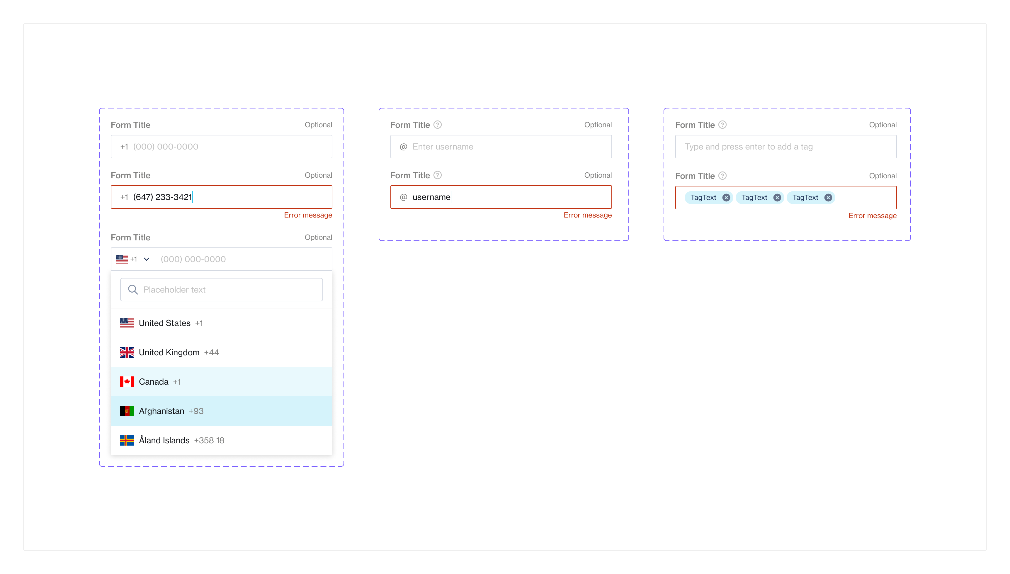
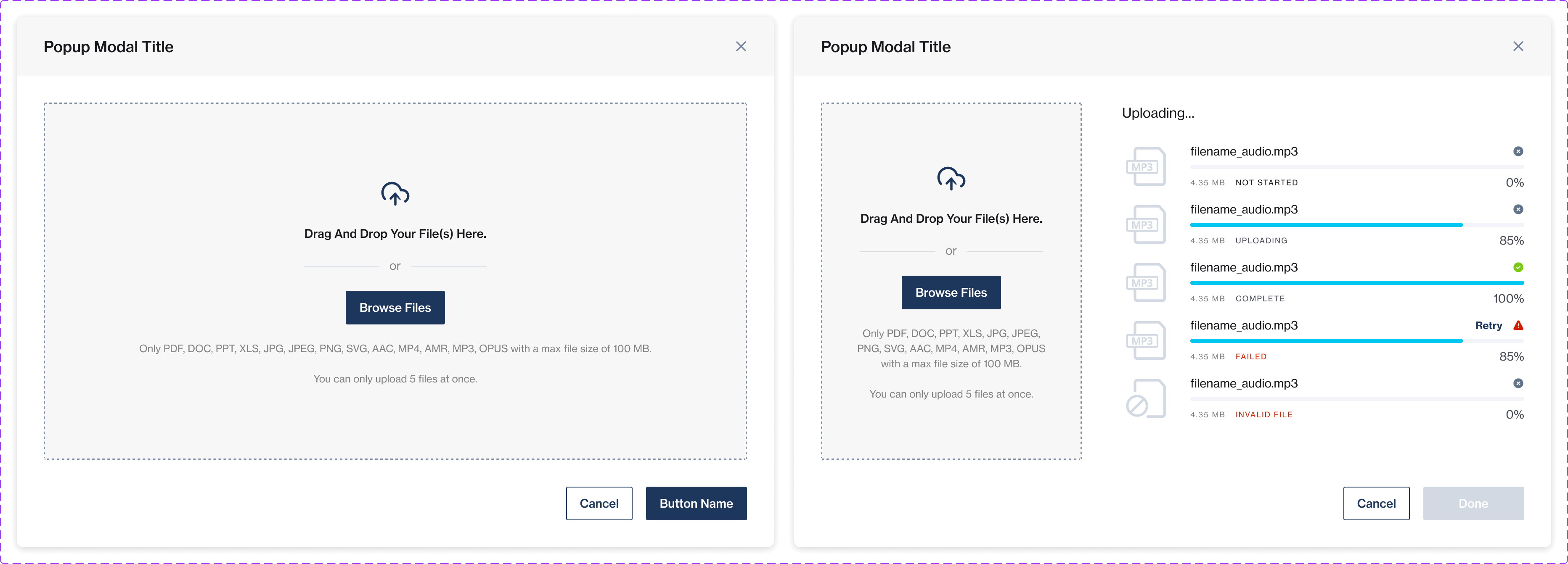
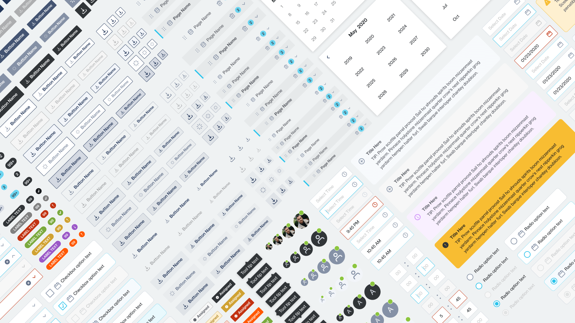
Atomic Components
A view of some of the atomic components built. A total of 22 components and always growing.
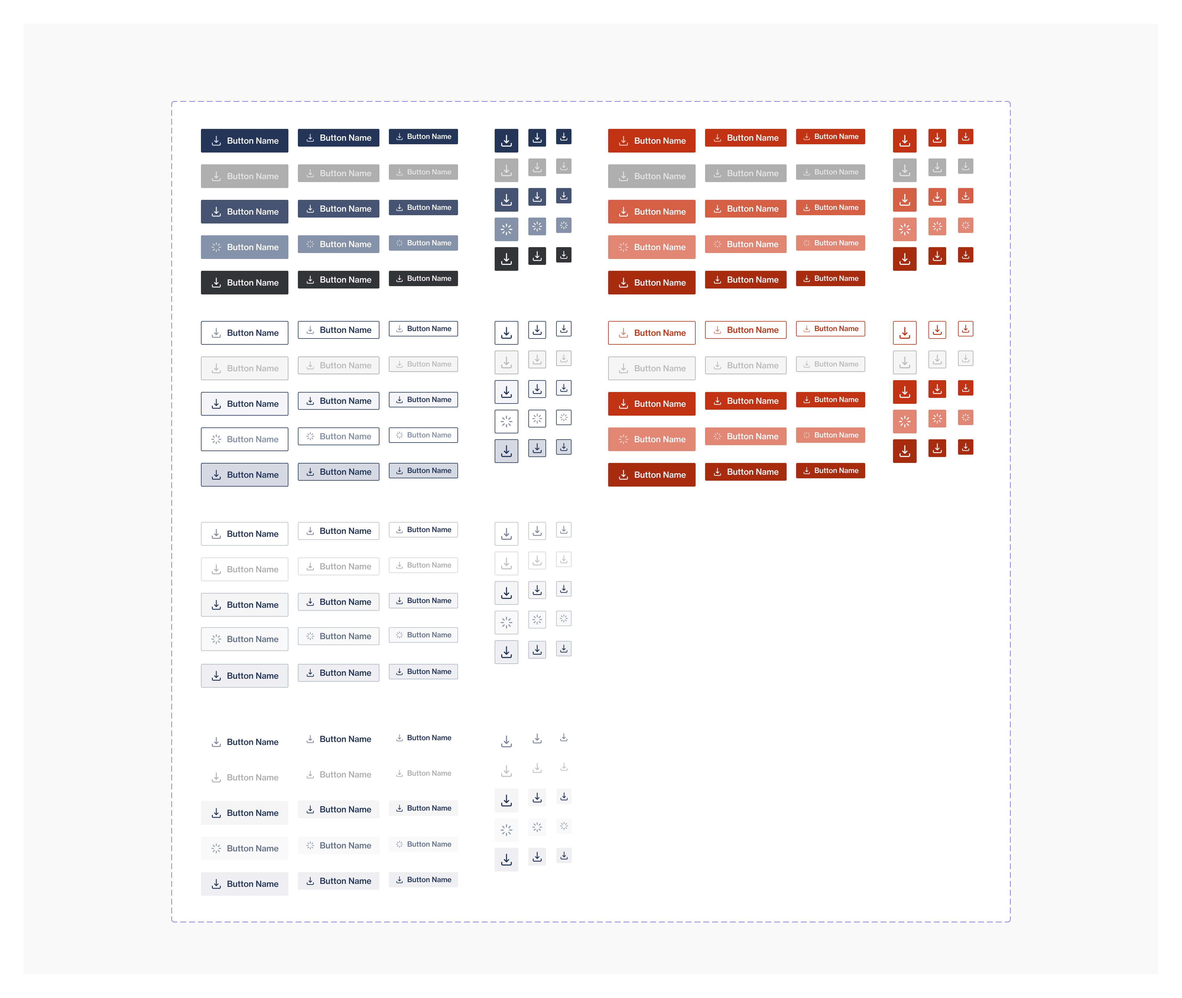
Components Built With Flexibility
All components were created with care and ensuring that usage was flexible and also scalable to the needs of the designs.

Prototype Ready Components
Prototype interactions were also added to most components that required interactions. This allowed designers to prototype faster and have working base components ready to use.

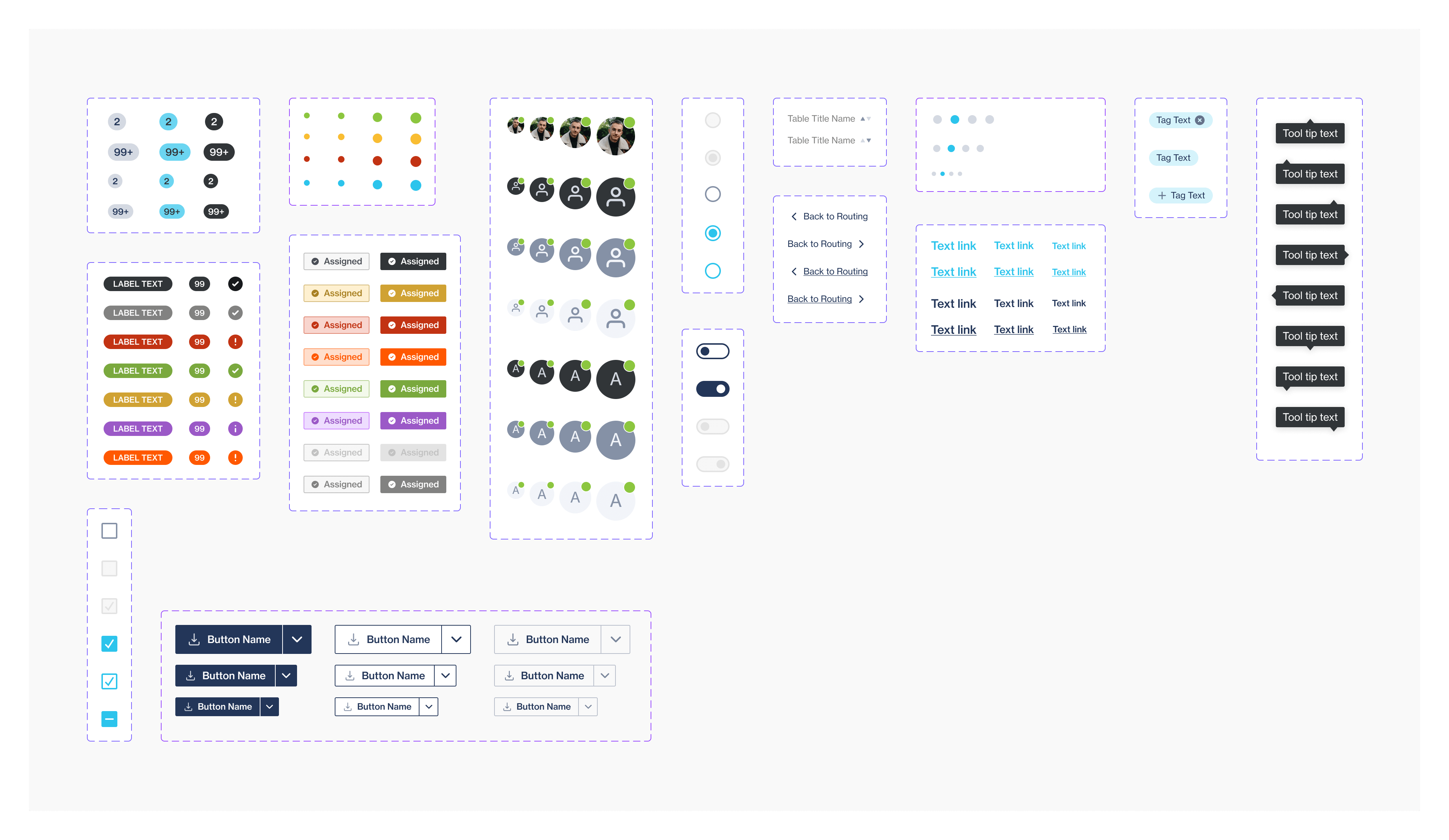
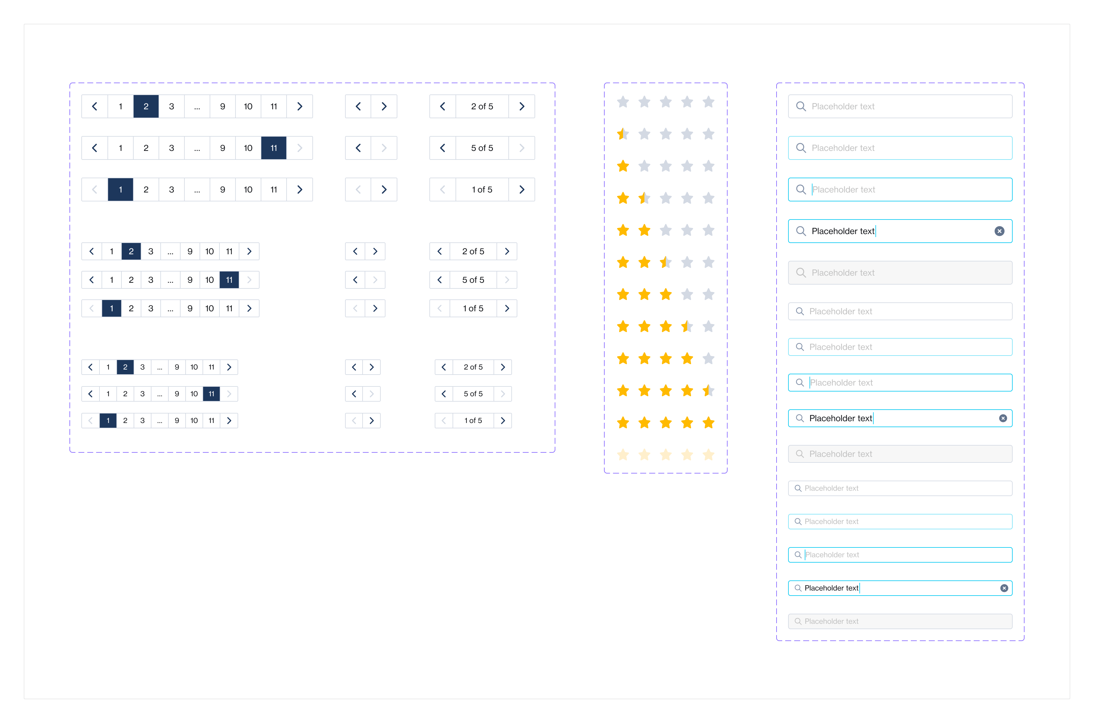
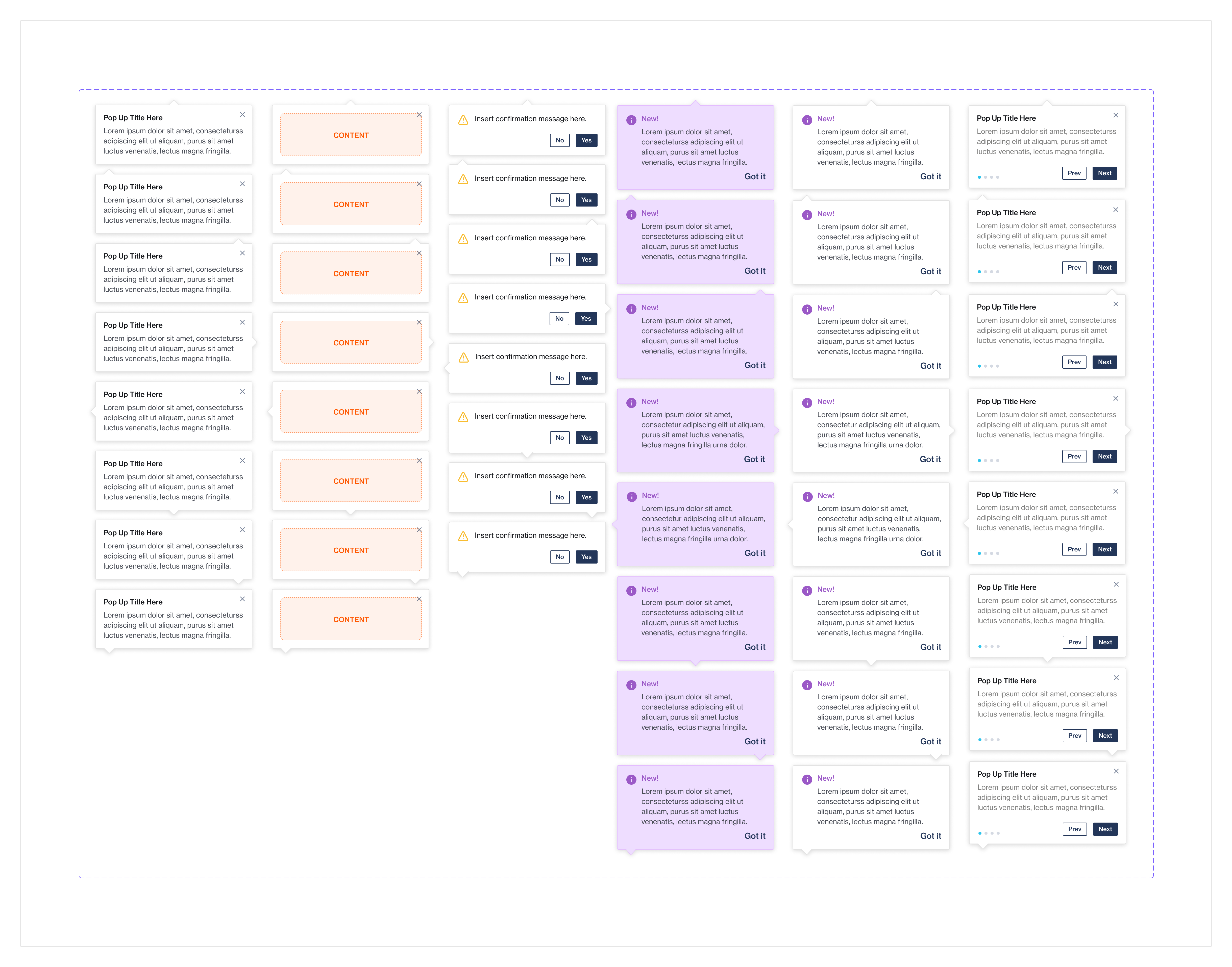
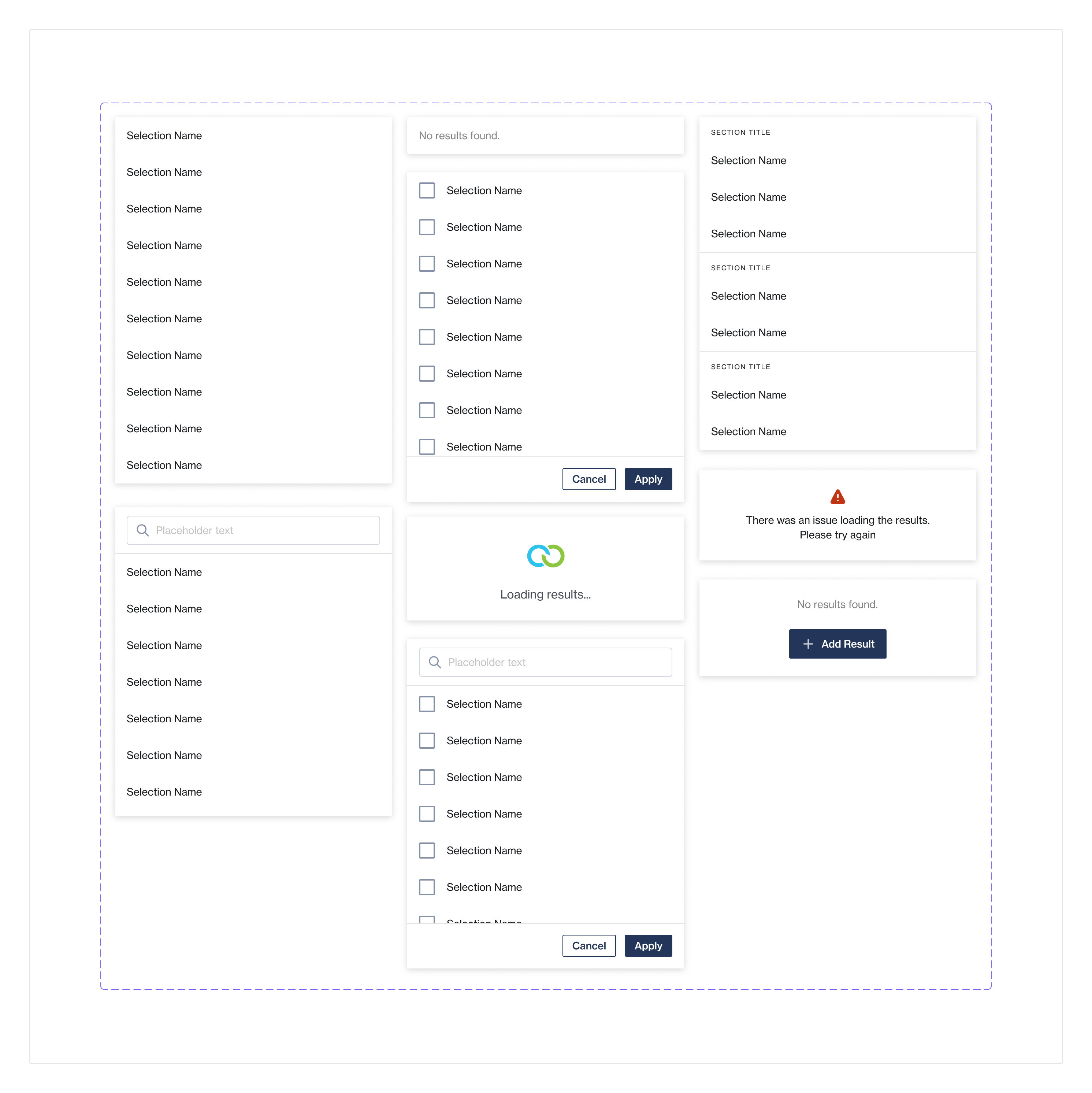
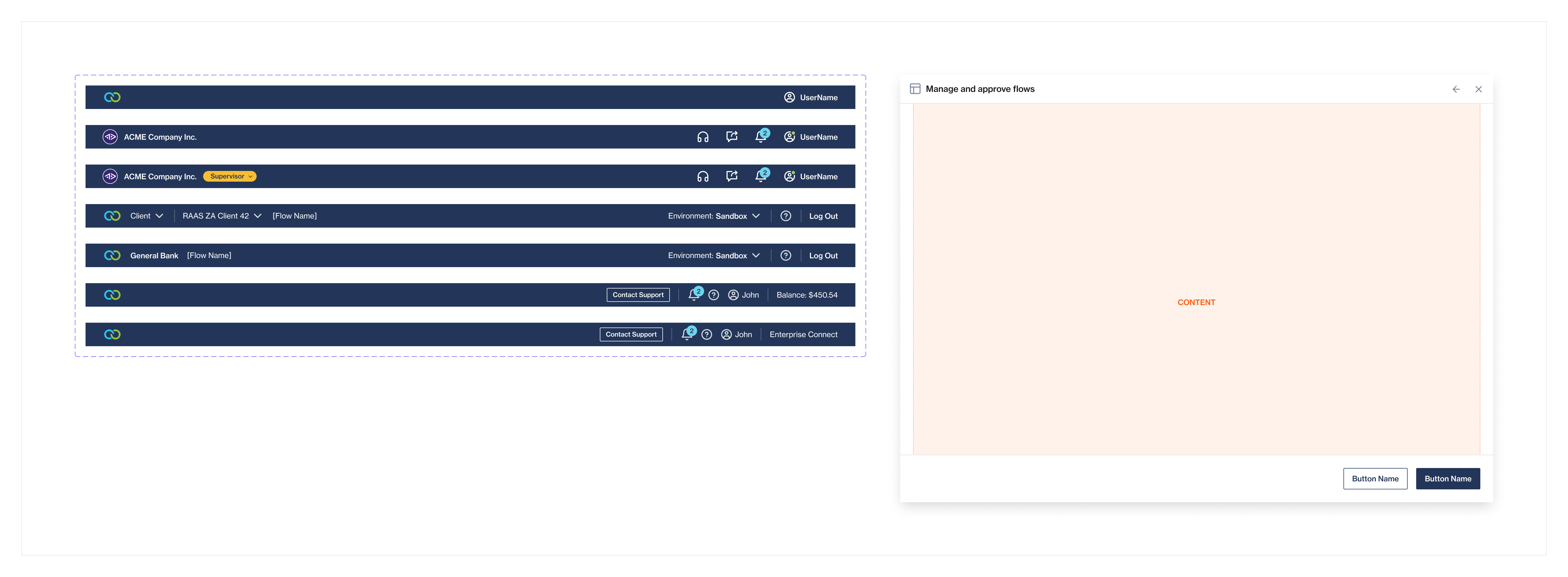
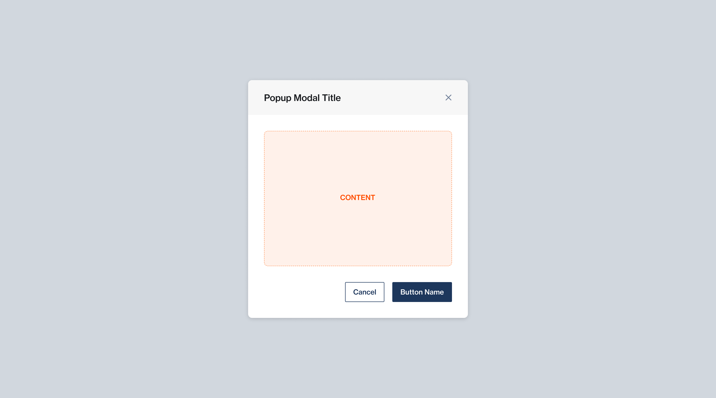
Molecular Components
Once the atomic components were established, the molecular components could start to take shape. Clickatell's Design System at the momemt has over 38 molecular components. A few examples can be viewed below:
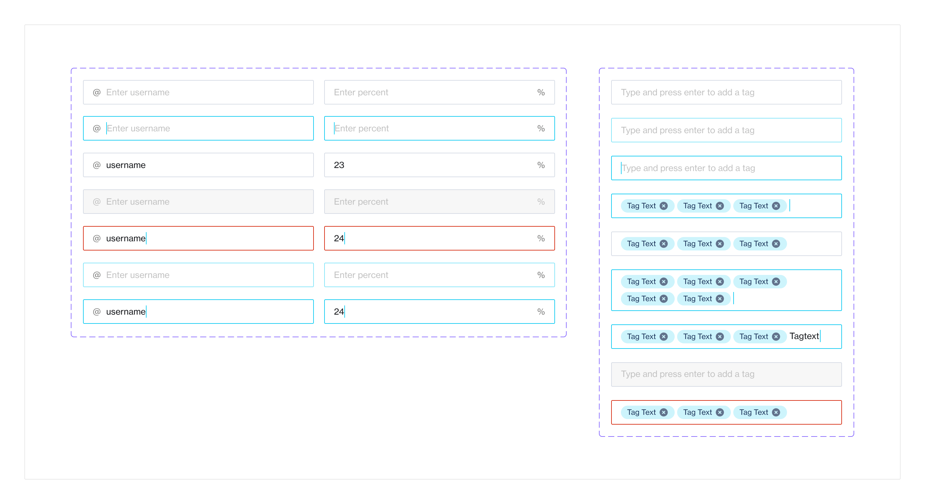
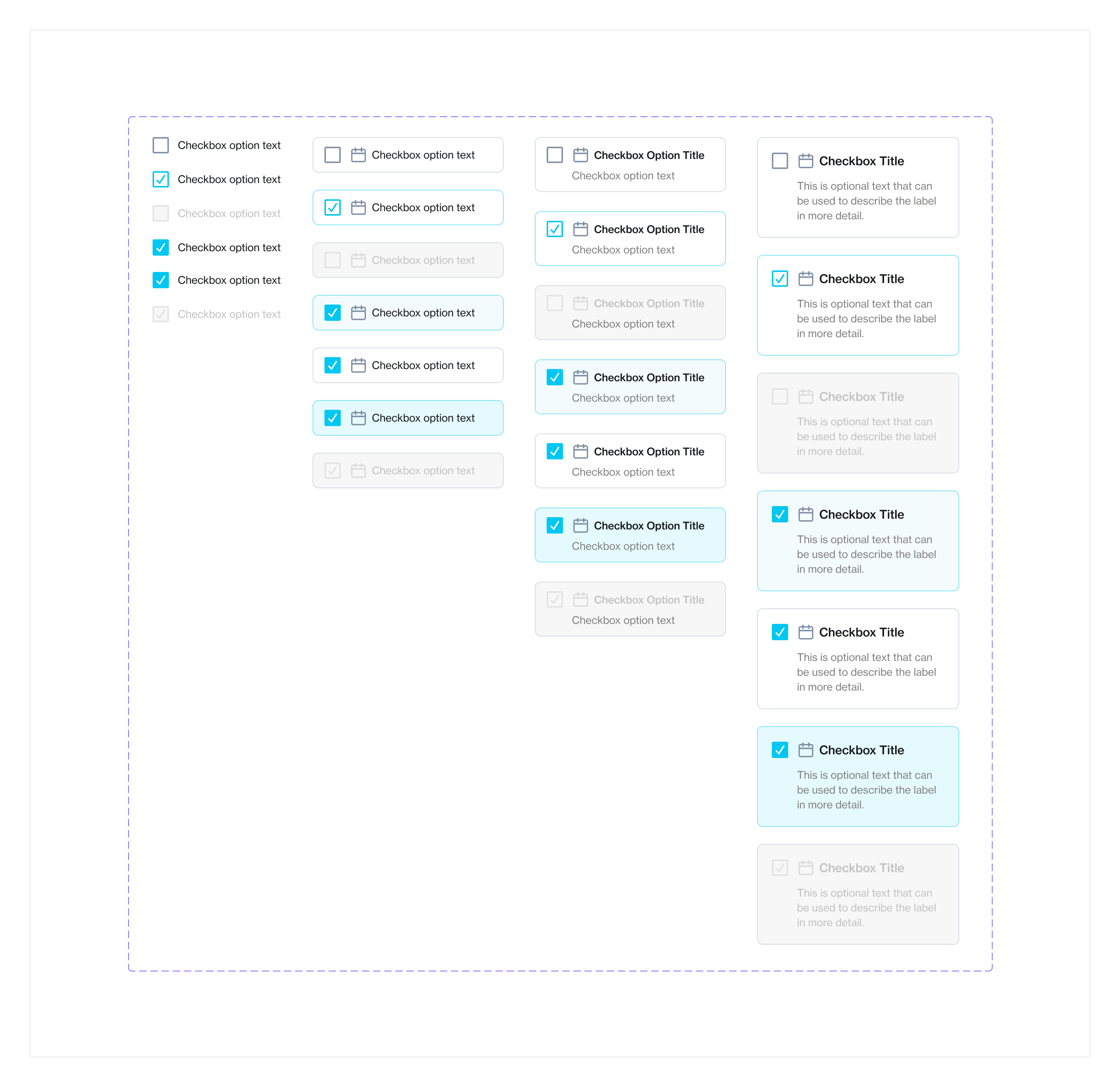
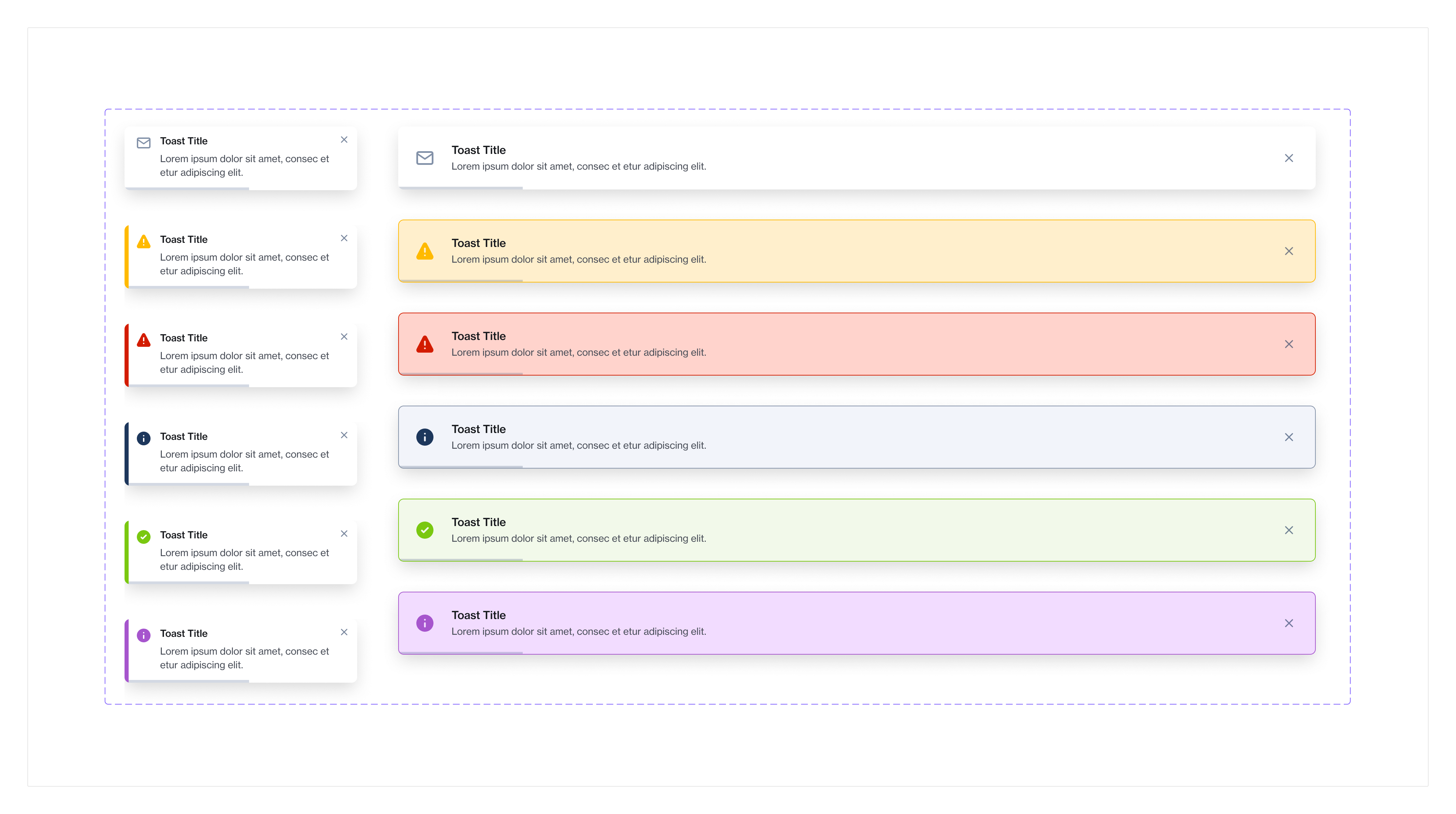
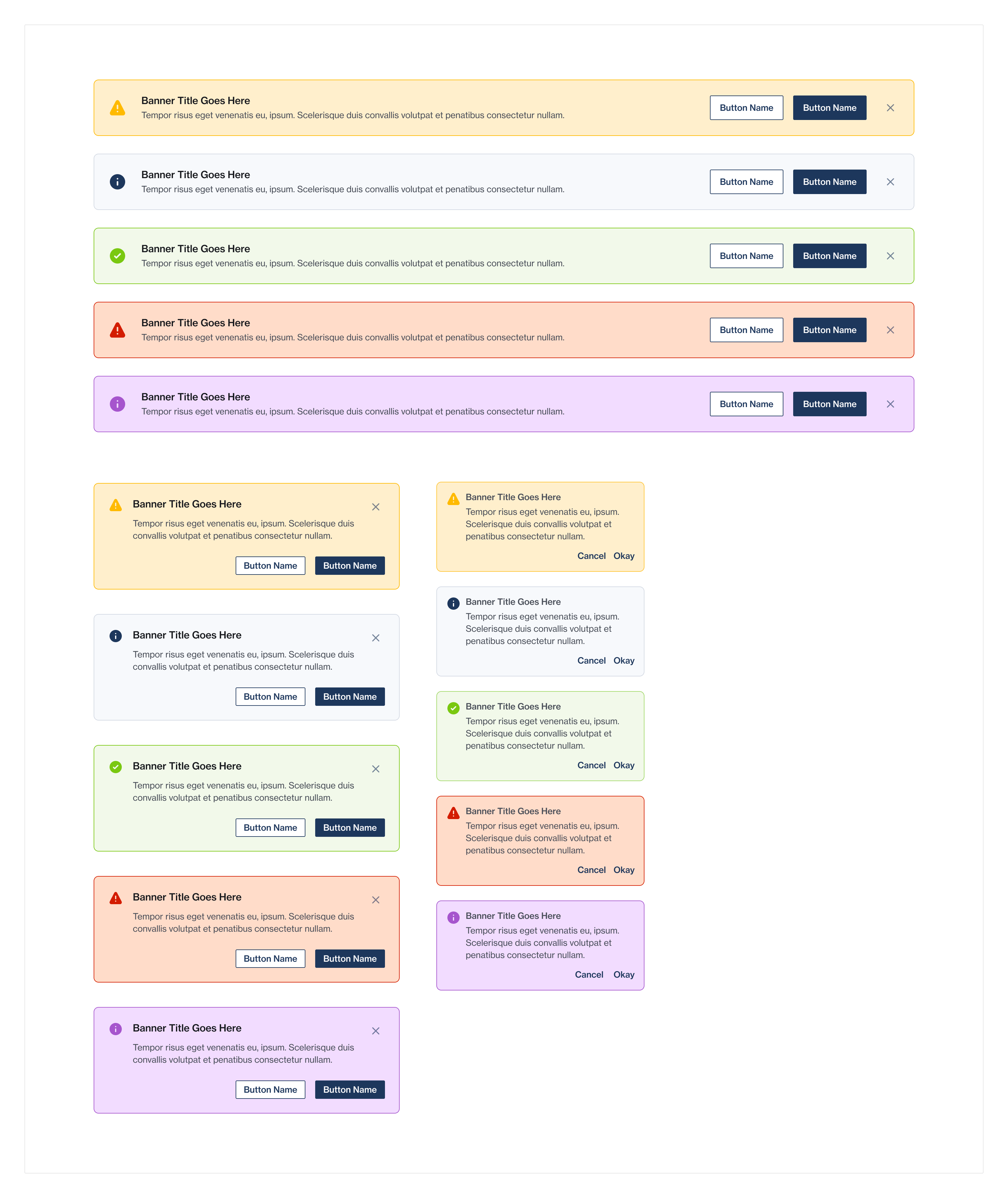
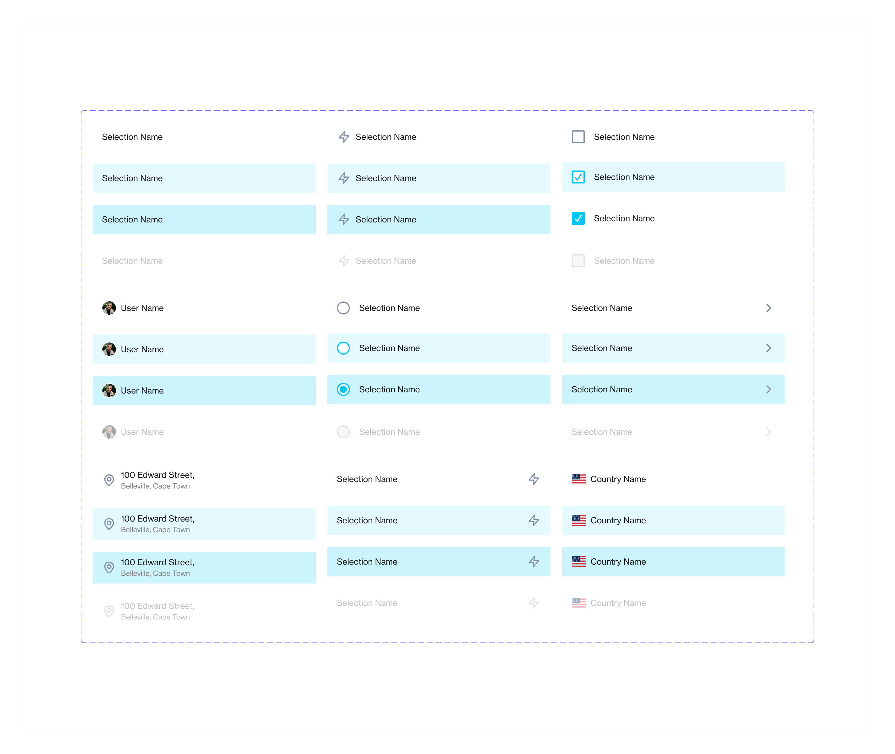
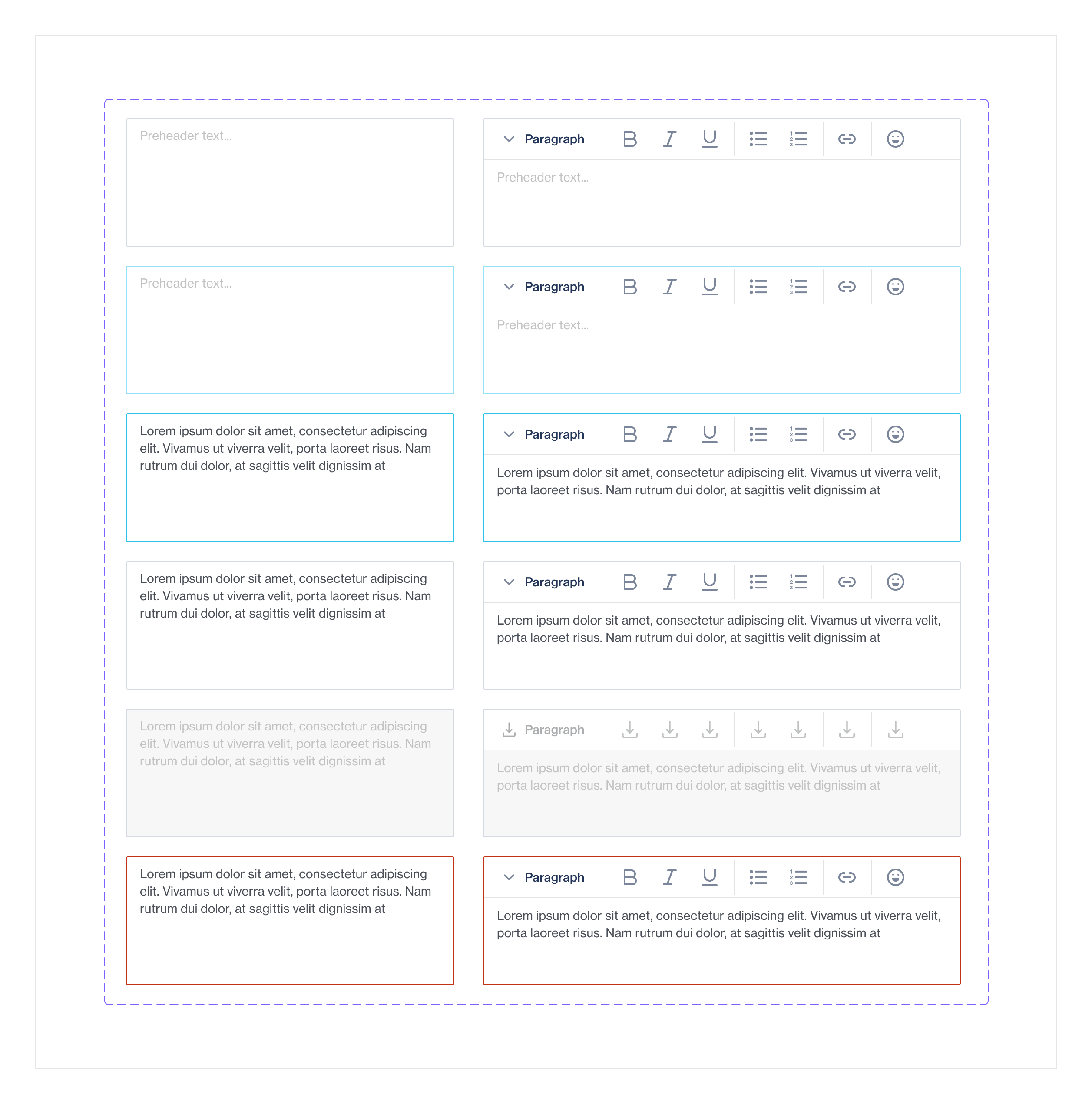
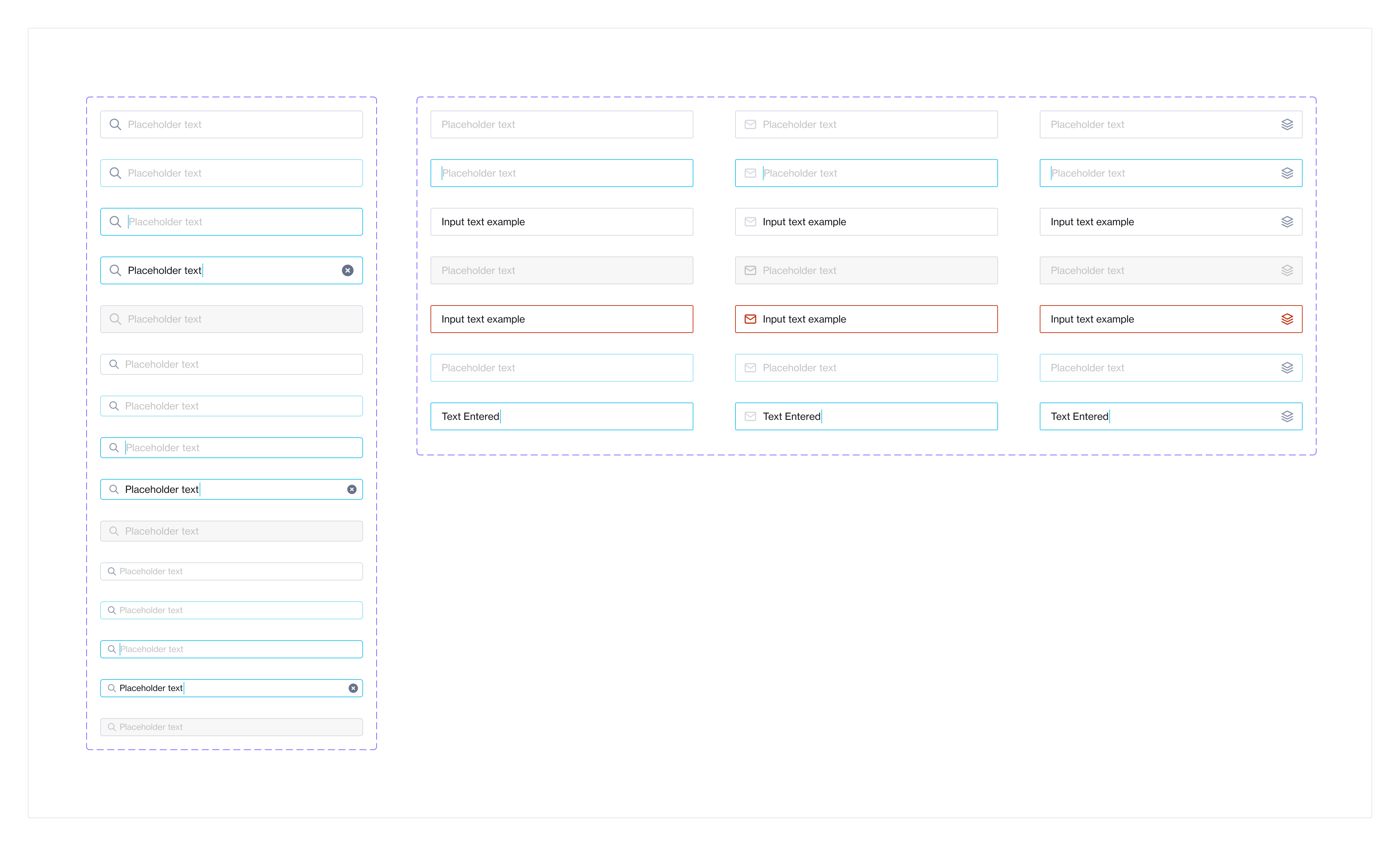
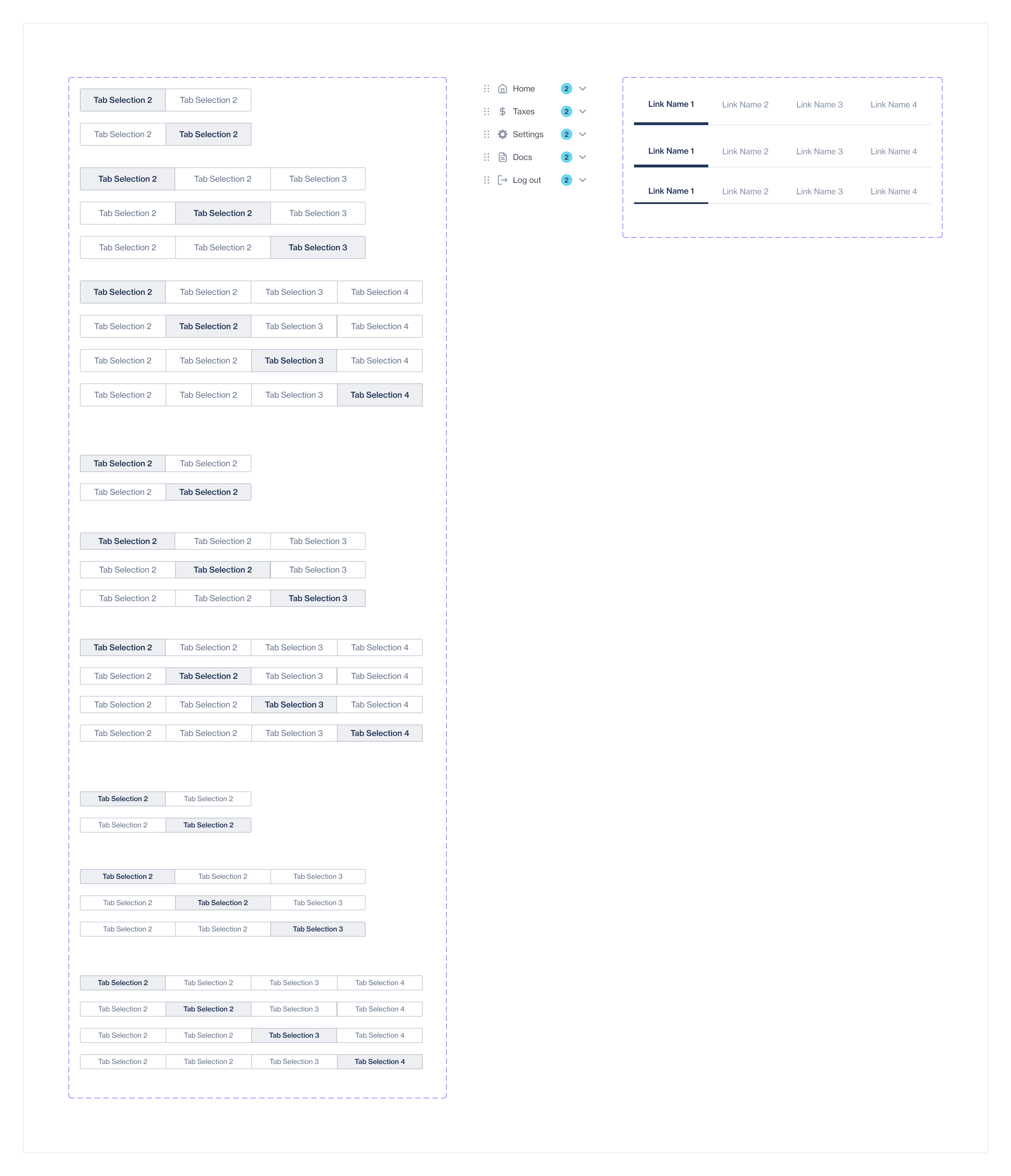
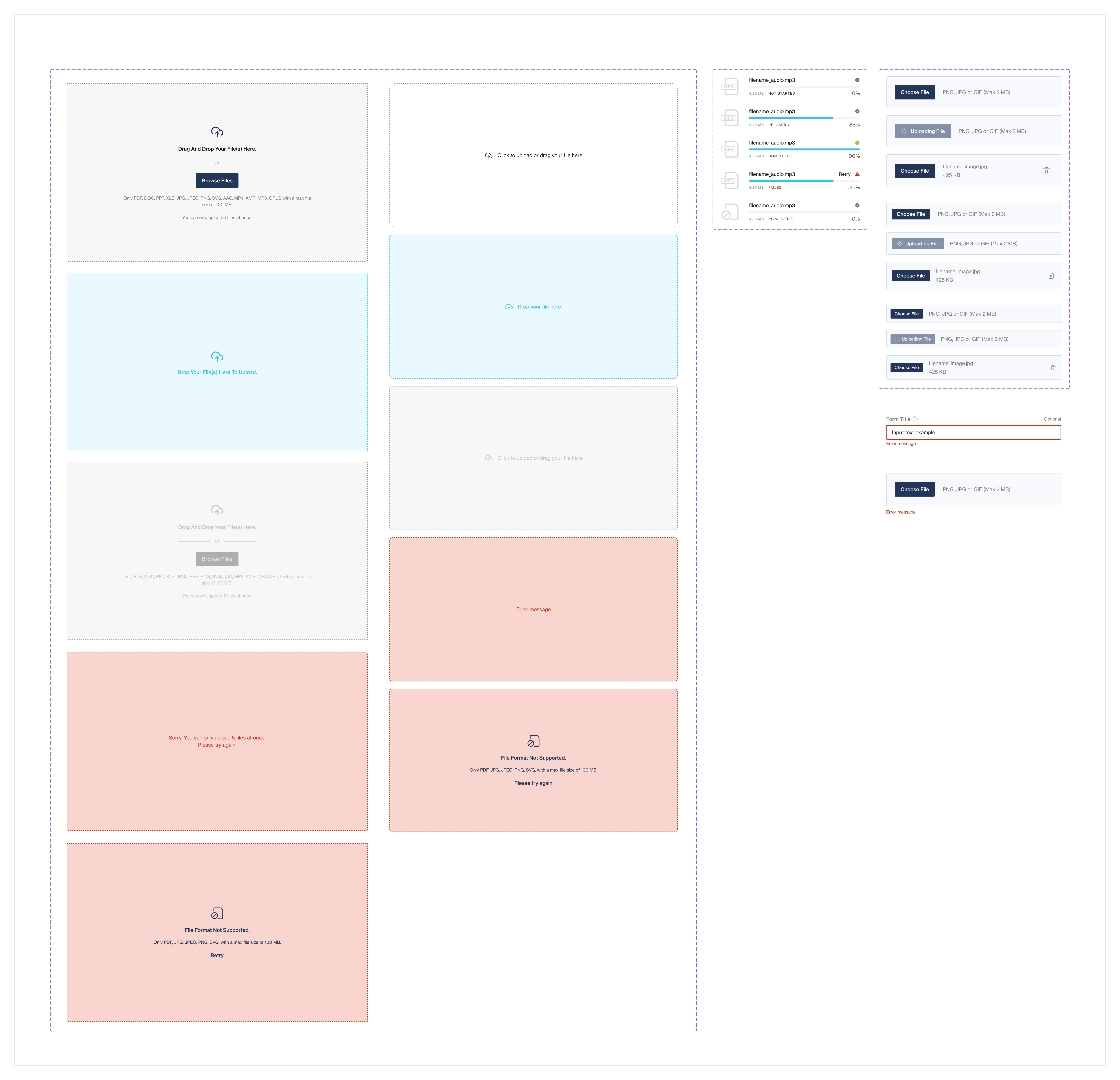
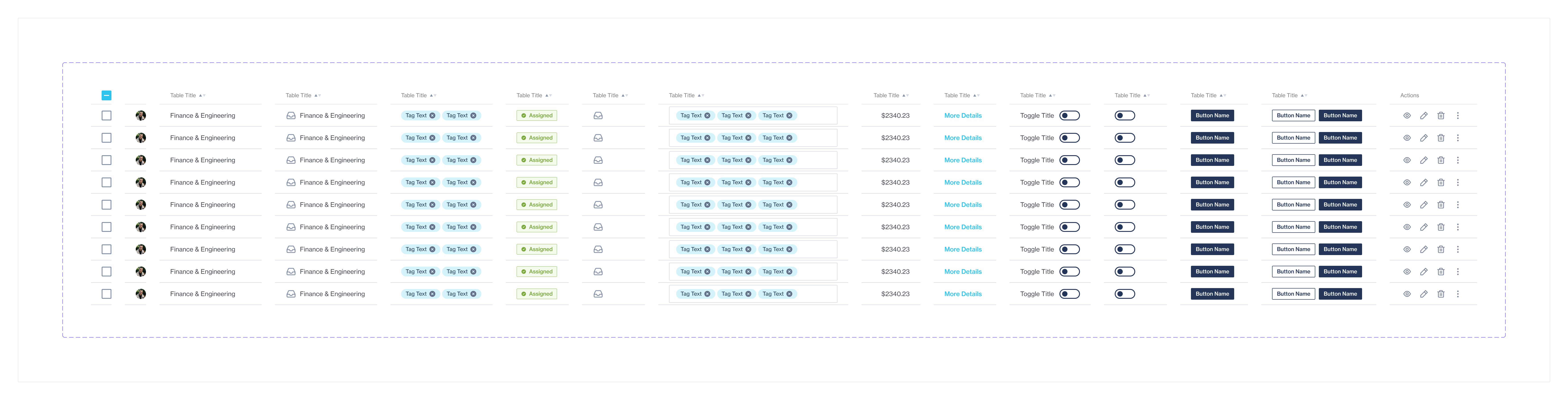
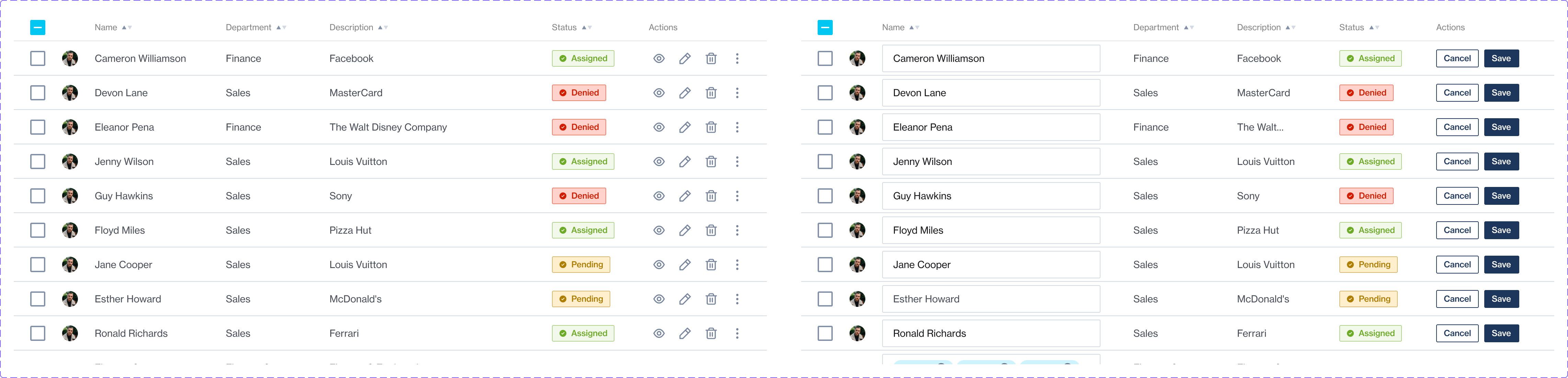
Organism Components
Organism level components could then be built once the molecular level components were established. A total of 28 (and growing) components. Organism components also included all form components (like input forms, etc).
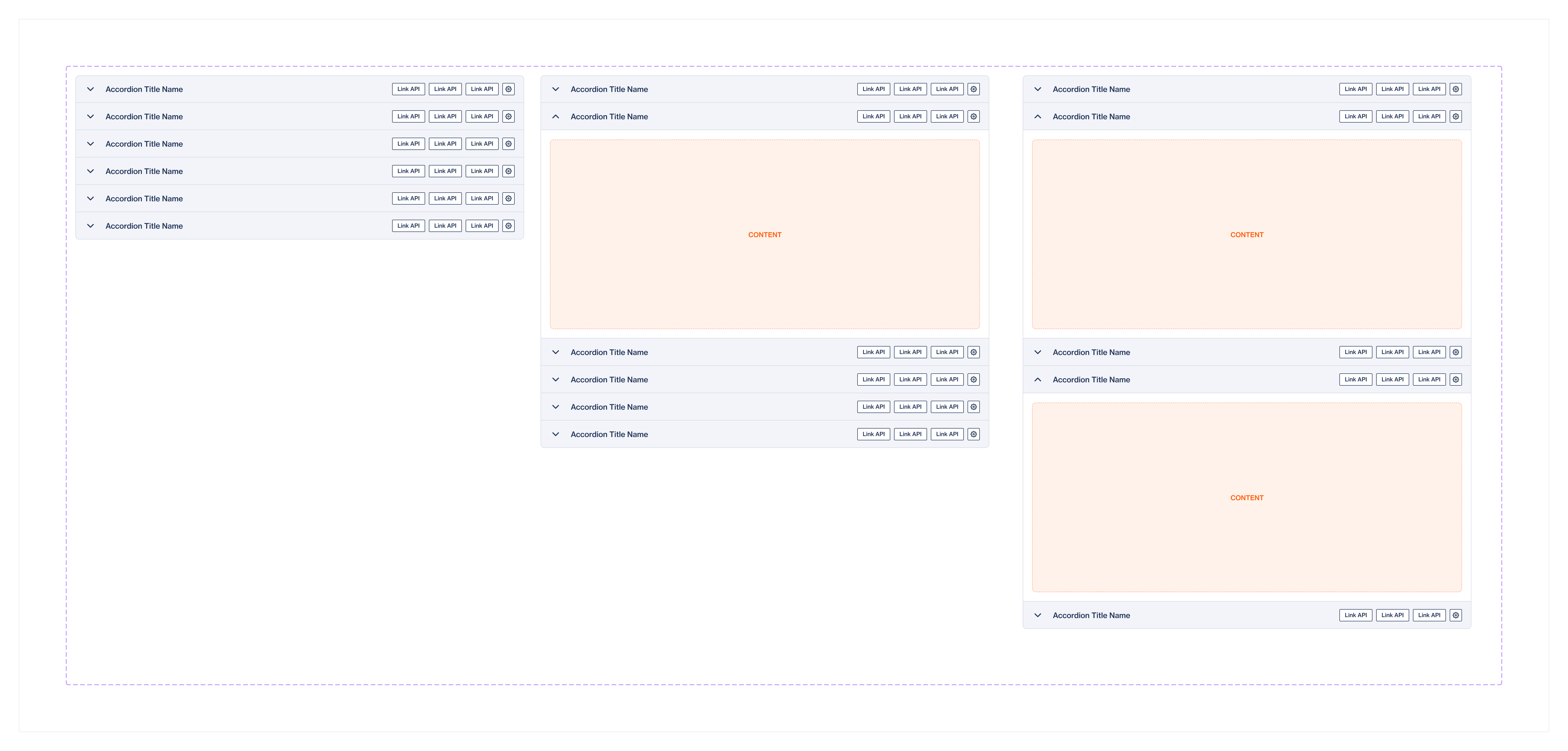
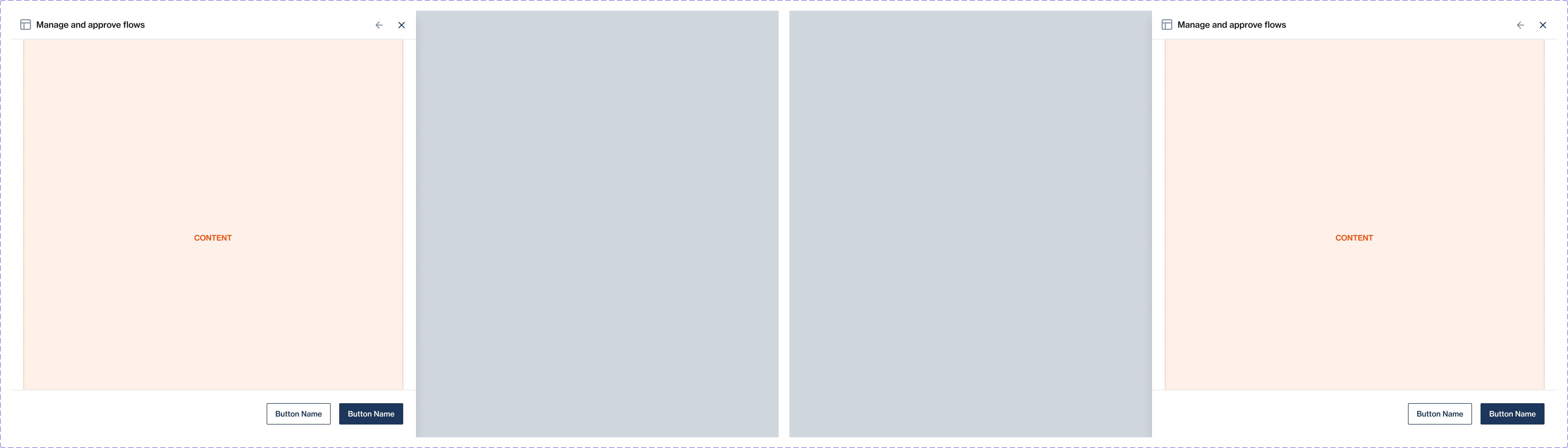
Templates
Templates, situated at the page level, organize components within a layout and establish the core structure of the design's content. These components are designed to be separated and further customized, with templates serving as the foundation for the UI layout.

Results
- Achieved a significant reduction in design and development time, enhancing productivity.
- Improved UI consistency and user experience across Clickatell’s product suite.
- Established a scalable foundation for future design, allowing for easy updates and modifications.
- Full Designer Adoption: The design system was fully embraced by the design team. Designers quickly adapted to using the system, appreciating its ease of use and the efficiency it brought to their workflows. This complete adoption has led to a noticeable improvement in design coherence and has streamlined the design process across different projects and teams.
- Effective Utilization: Designers are now using the system to its full potential, leveraging the standardized components and guidelines to create high-quality designs more quickly. The system's intuitive structure have empowered designers to innovate within a consistent framework, enhancing both creativity and consistency.

Ongoing Work and Future Outlook:
- Continuous Evolution: The design system is continually evolving, with regular updates and enhancements based on user feedback and technological advancements.
- Expanding Scope: Future plans include expanding the system's scope to incorporate more diverse design elements.
- Empowering Creativity: We aim to empower designers with more creative freedom within the system's framework, fostering innovation while maintaining consistency.
- Training and Onboarding: Ongoing efforts are focused on training new team members and refining the onboarding process to ensure seamless integration into our design methodology.
- Analytics & Performance: Upgrading to Figma's org plan and checking the usage and tracking lackluster components.
Reflections
Leading this project has not only refined my expertise in design systems and collaboration but has also underscored the transformative impact of a well-crafted design system on a company’s design culture and workflow efficiency.
Follow me
Want to get in touch?
Want to get in touch?
Email me at: hello@chelms.ca