GFC Logo Redesign & Rebranding
Ideacity Marketing Collaterals
A rebranding project for a local non-profit organization. Rebranding included a new logo, brand colours and typography, print and collaterals.
Ideacity is an annual conference hosted by ZoomerMedia bringing together some of the brightest minds on the planet. It has rightly earned its reputation as Canada’s “Premier meeting of the minds.” Presented below is a sample of marketing collaterals that has been designed to promote and strengthen the brand of ideacity.
ROLE: DESIGNER
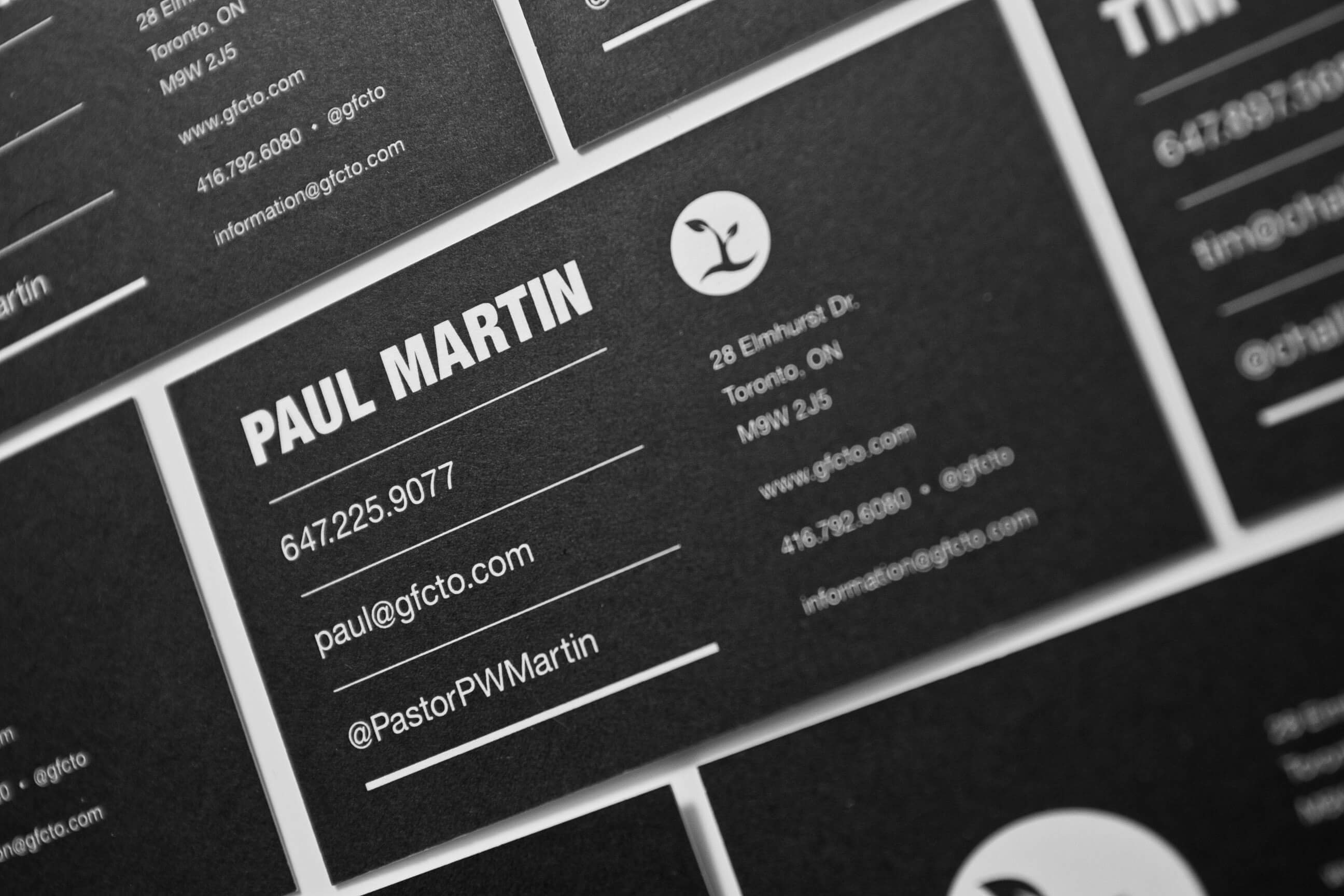
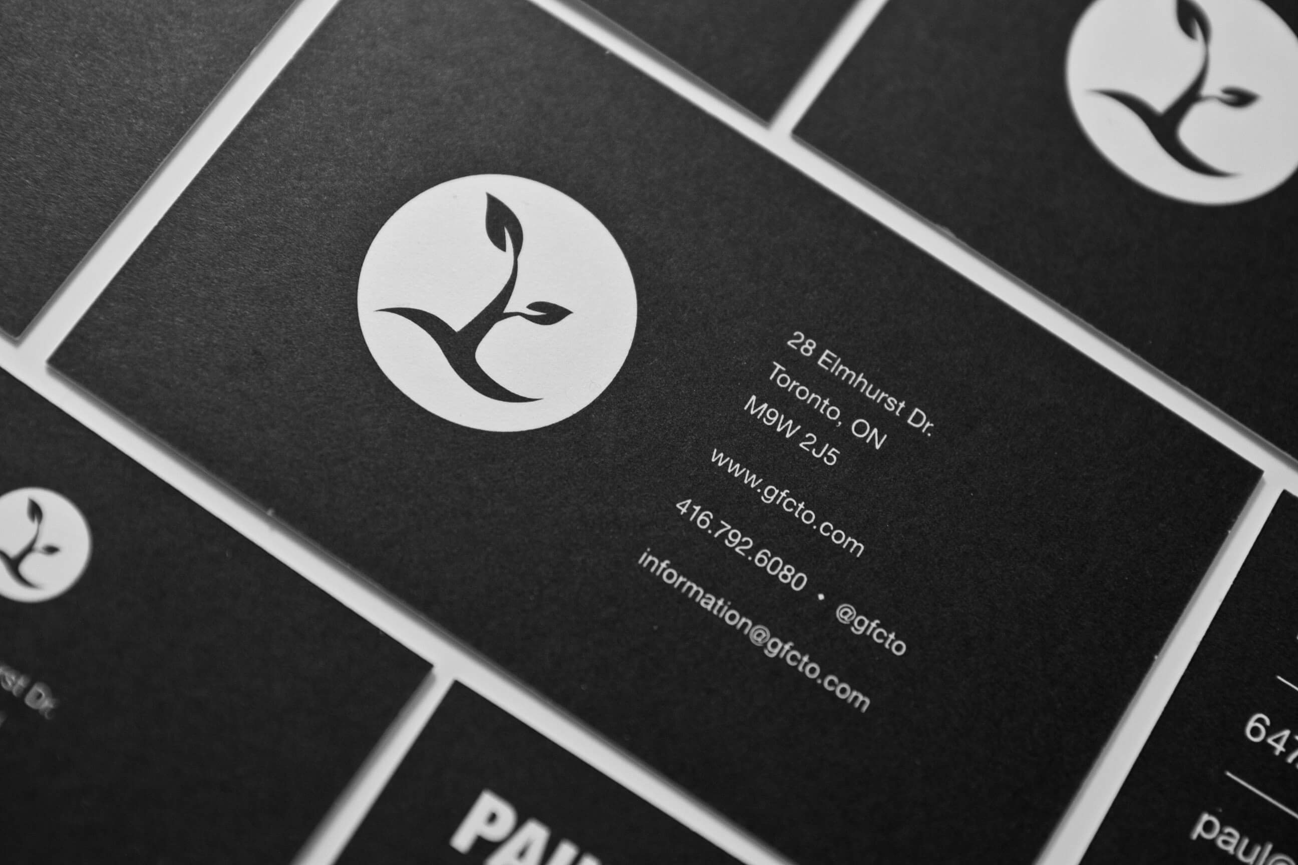
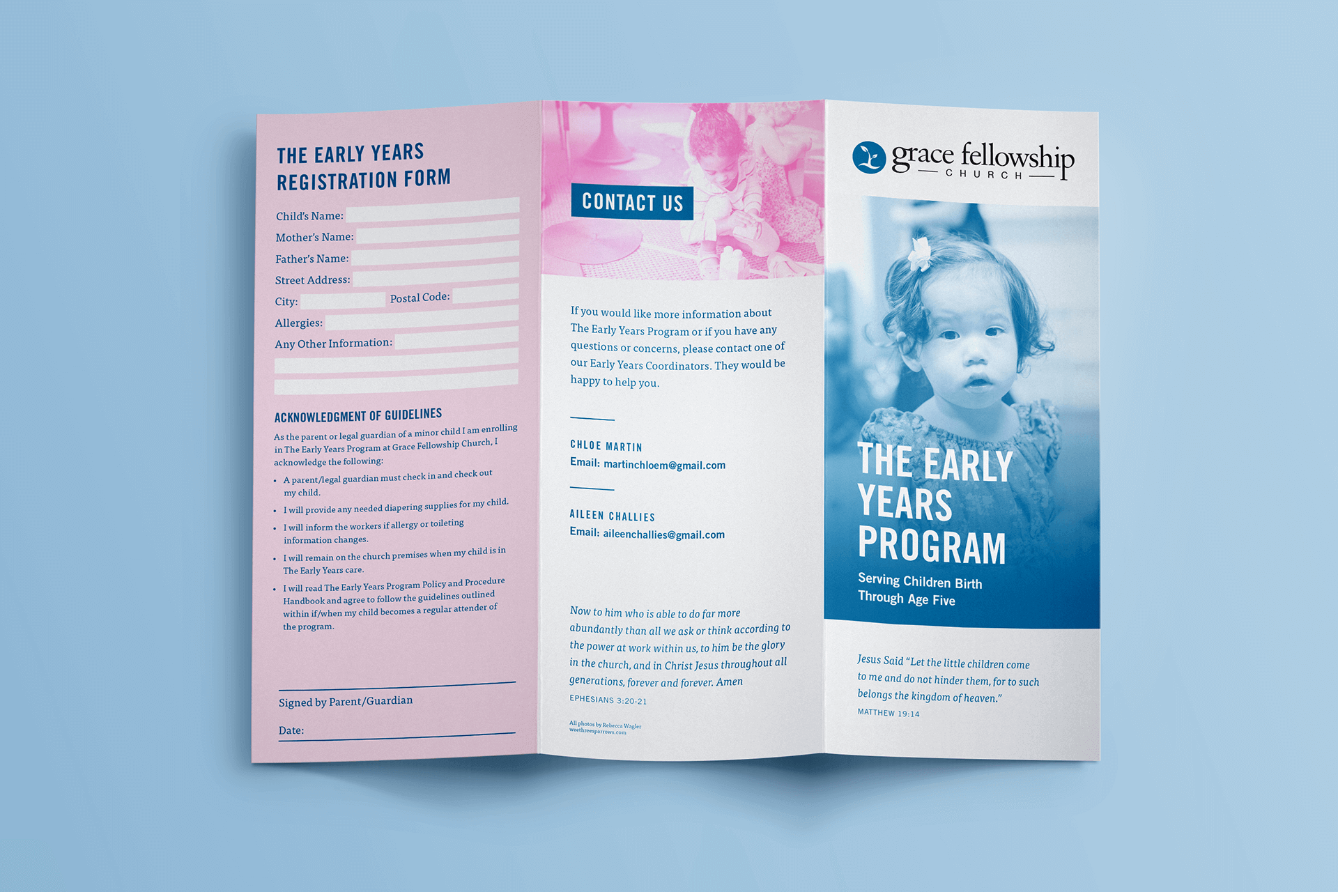
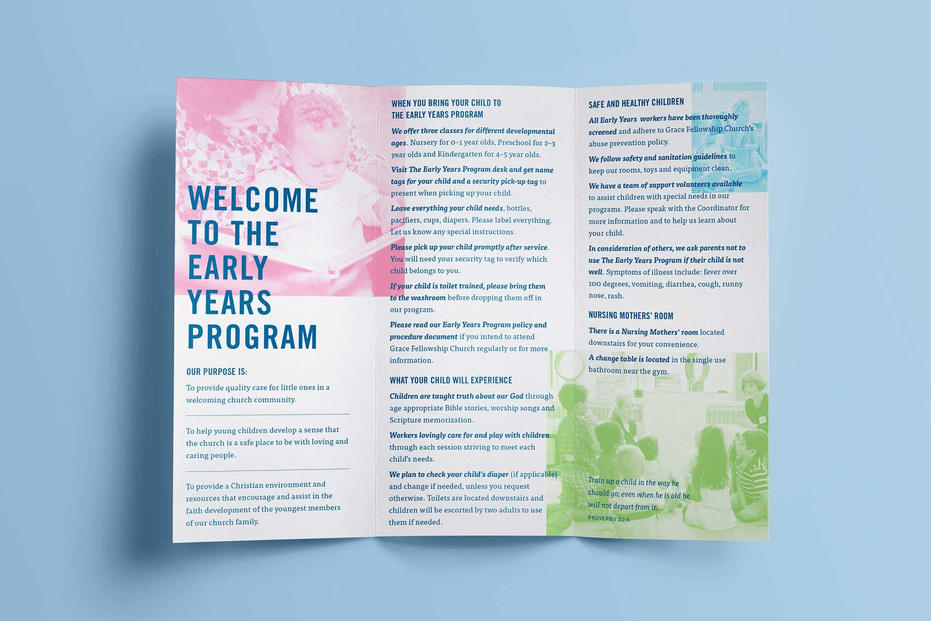
CLIENT: GRACE FELLOWSHIP CHURCH
TOOLS USED: PHOTOSHOP, ILLUSTRATOR, INDESIGN
YEAR: 2011
TYPE: PRINT DESIGN, PRINT PRODUCTION
PREVIOUS LOGO


LOGOMARK
A circle is used as the icon graphic because it represents principles on which the church was founded: wholeness, focus, unity, nurturing, and mobility. The foliage represents growth, life, health, and renewal.
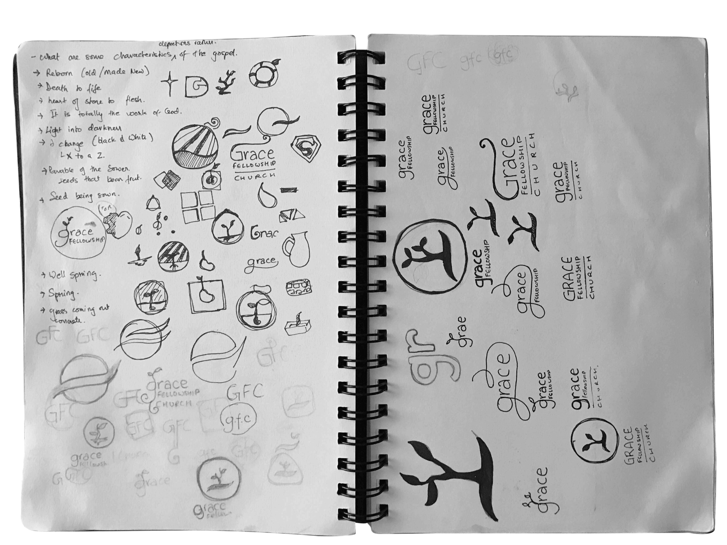
PRELIMINARY IDEATION AND SKETCHES

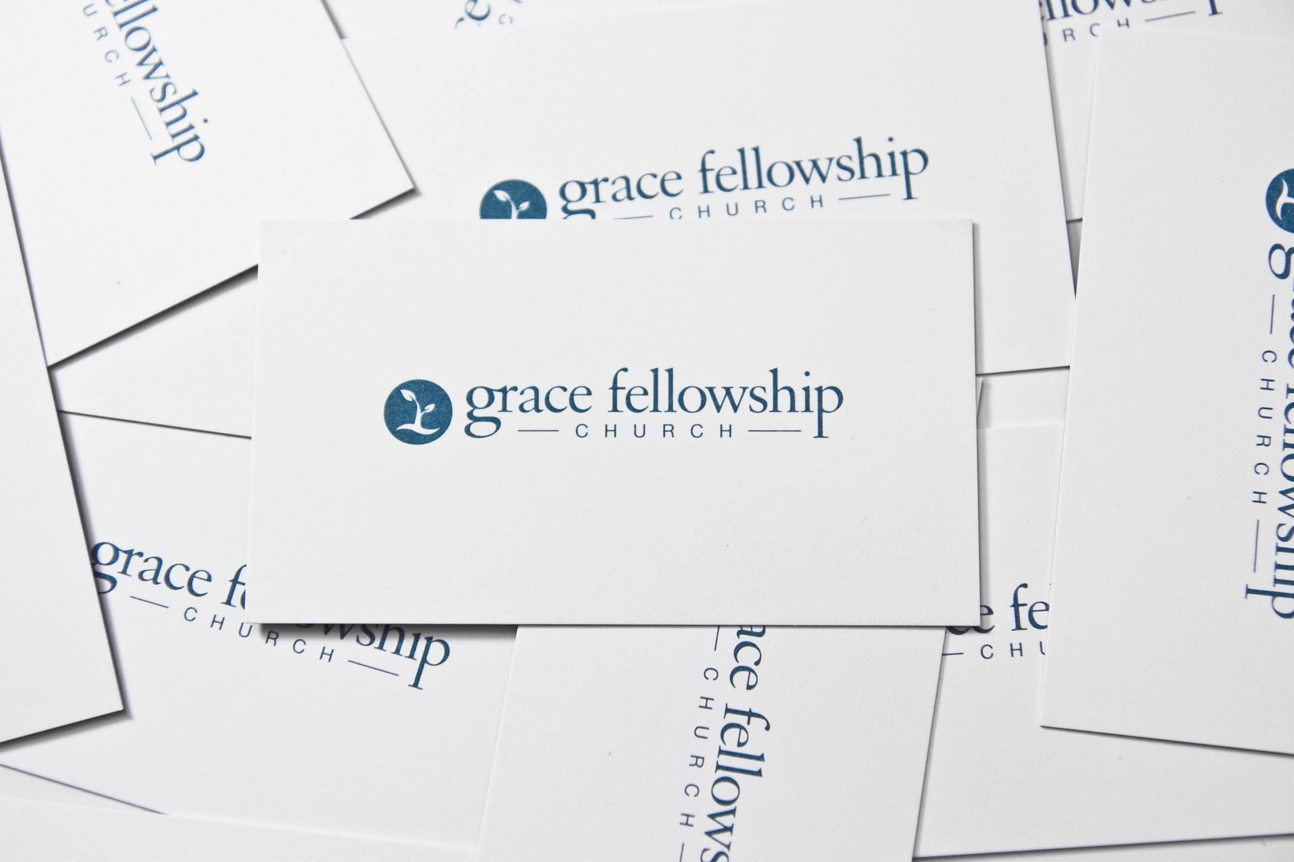
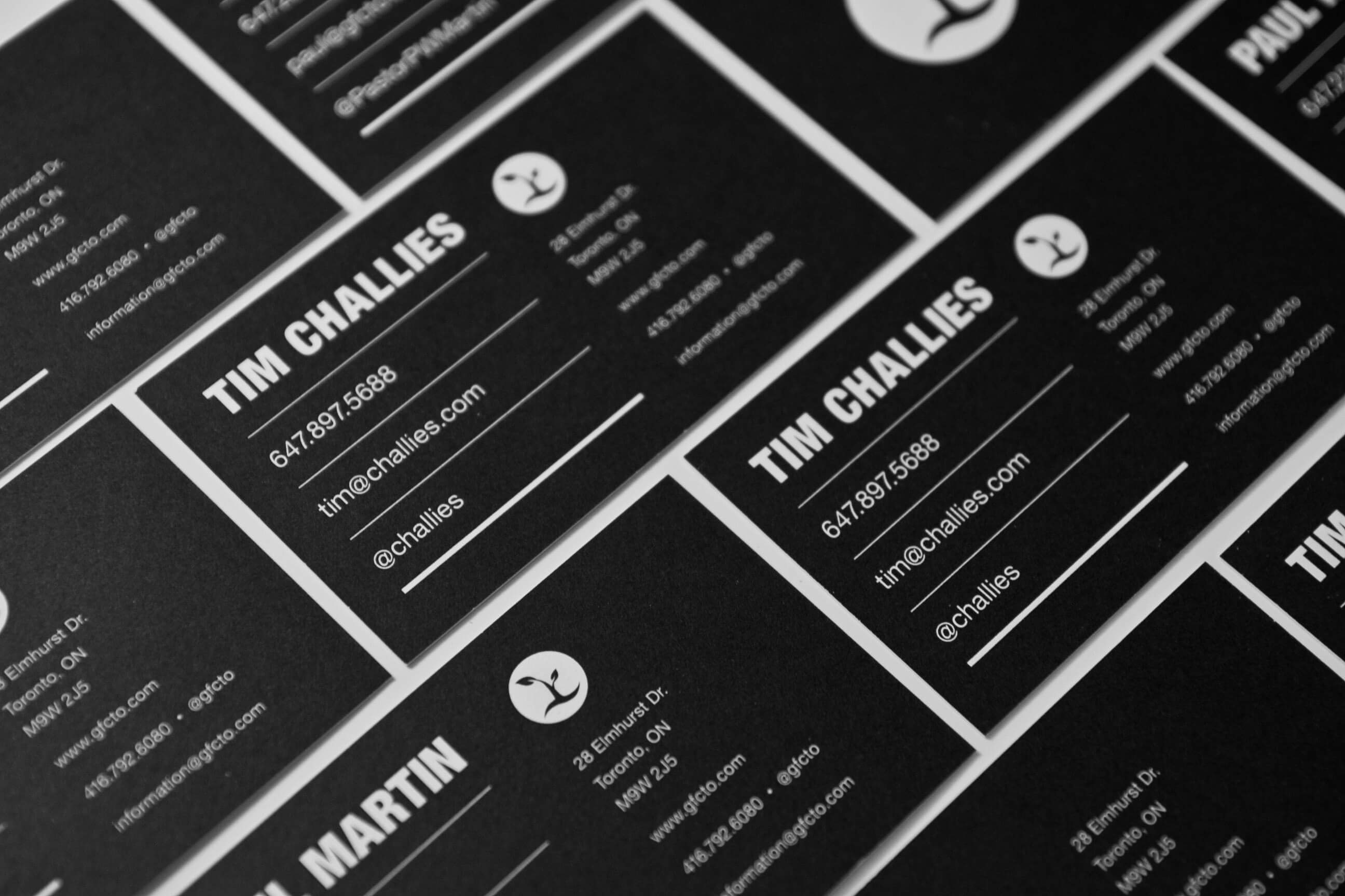
LOGOMARK APPLICATION


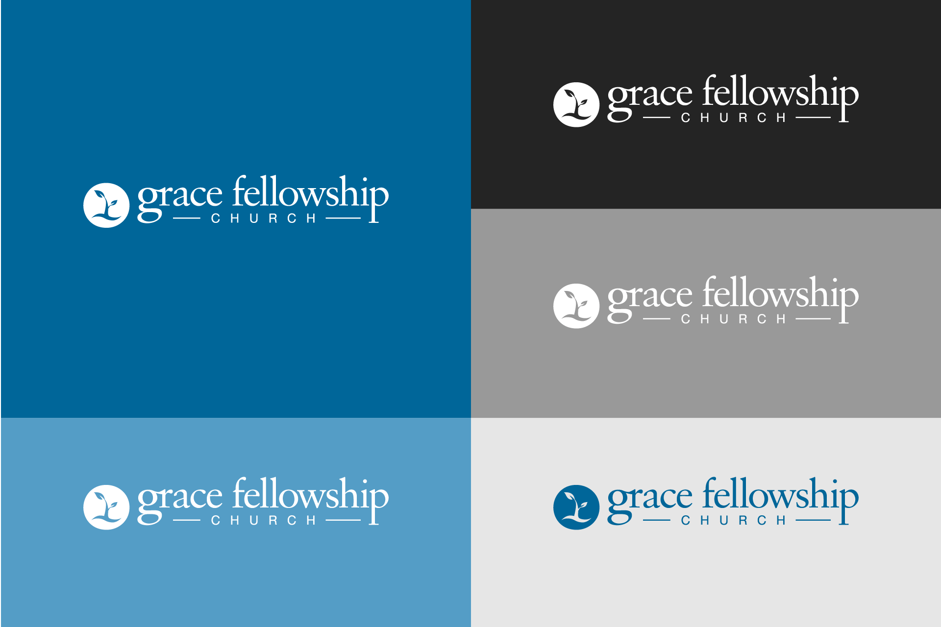
BRANDING COLOUR SCHEME

Follow me
Want to get in touch?
Want to get in touch?
Email me at: hello@chelms.ca